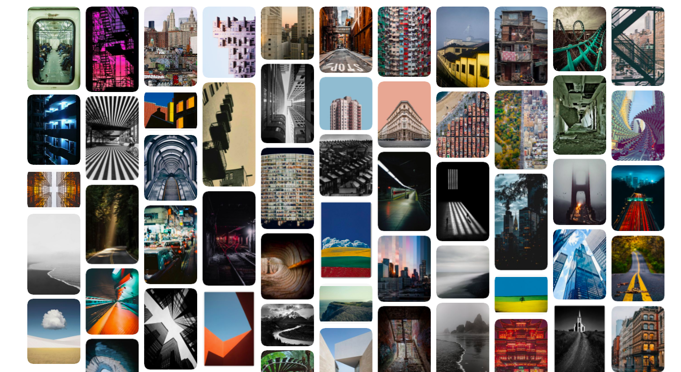
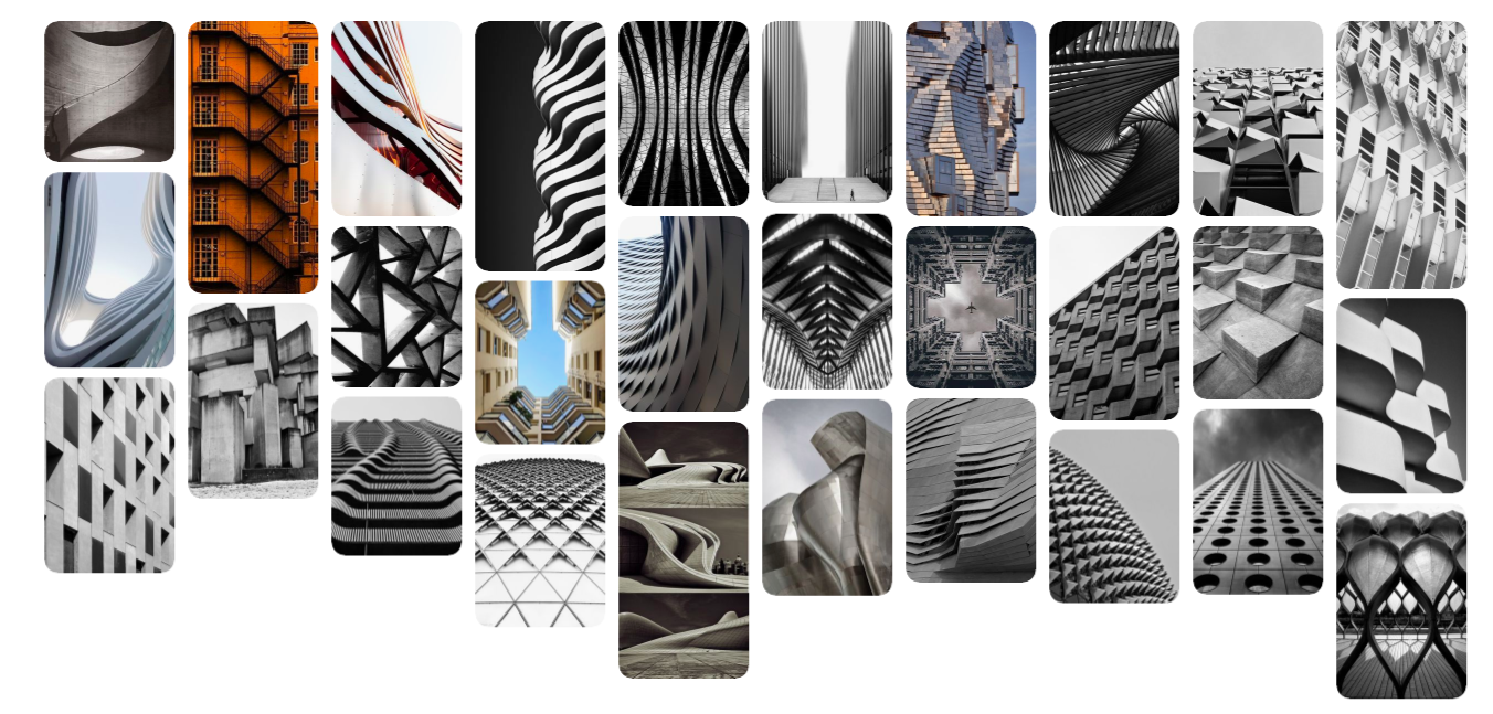
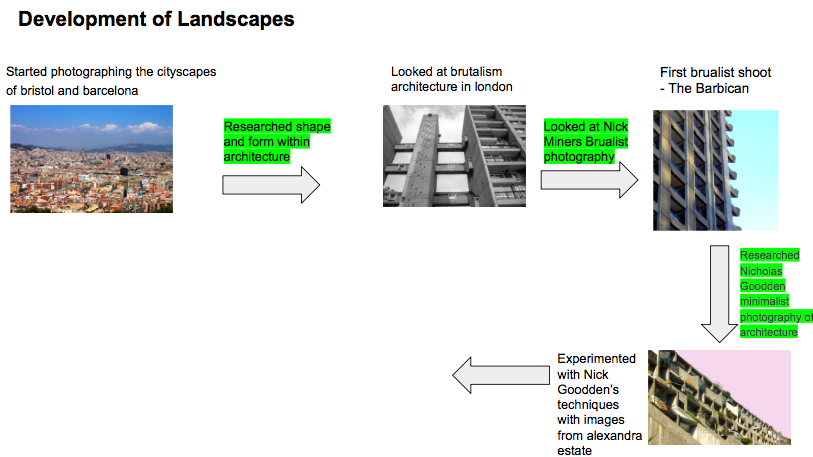
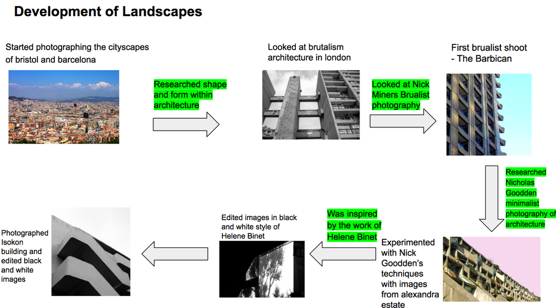
Landscape photography is very broad and takes so many different forms that I made this collection of images as a starting point for inspiration. From this, I could narrow down what direction I wanted to go in. Although I appreciate natural landscapes, I decided I was going to focus on cityscapes as it is what surrounds me on a daily basis. Growing up in London - one of the most highly regarded capital cities architecturally - is a fantastic opportunity. I aim to photograph other cities too, in addition to London, so I can compare the range of architecture I come across.
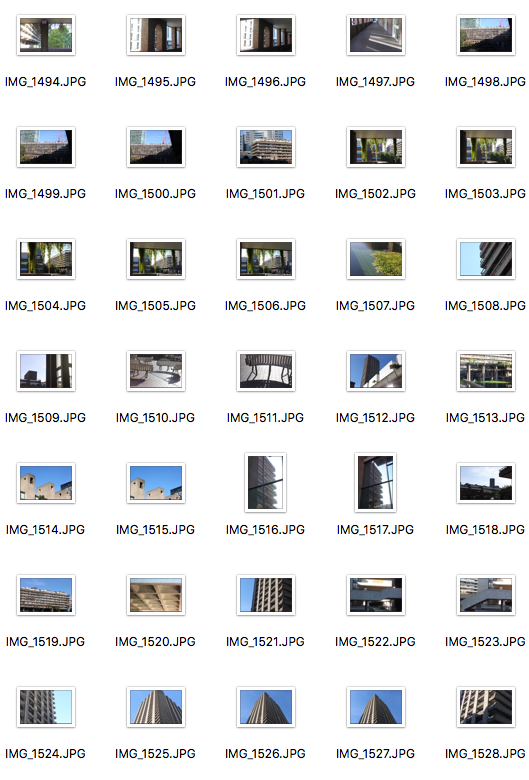
Shoot 1 - Bristol
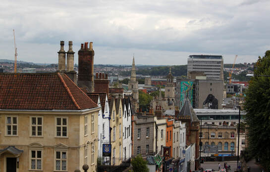
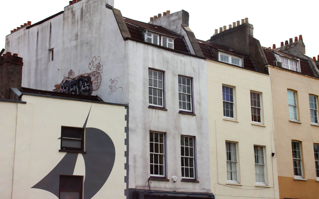
Photographing around Bristol allowed me to capture the architecture of the city. As Bristol experienced a period of extensive wealth and growth during the nineteenth century, most of the buildings have a similar structural design and aesthetic from that period. With the exception of some modern buildings - recent constructions in areas of development - most of the houses use traditional materials and have characteristic features of small windows and sloping red roofs.
|
|
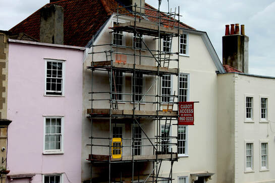
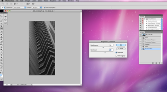
I edited this image to make the brightness darker and increase the contrast. I thought this would enhance the colours in the image. The robust, metallic structure of the scaffold juxtaposes with the baby pink colour of the house. Also, the geometric structure of the scaffold breaks up the solid area of expanse of the the building and makes it more interesting to the eye.
|
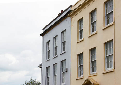
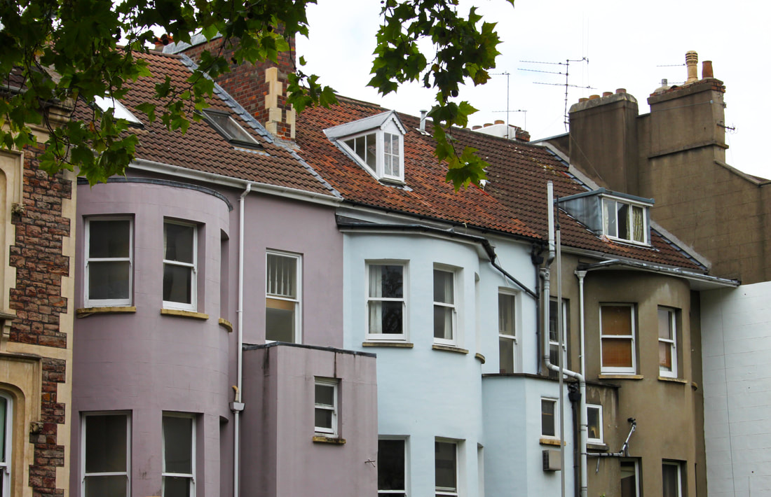
The pastel blue and yellow colours of the houses complement each other. I rotated the image slightly so that the lines of the building would be straight. Additionally, I slightly increased the saturation and vibrance in order to warm the tones of the colours.
|
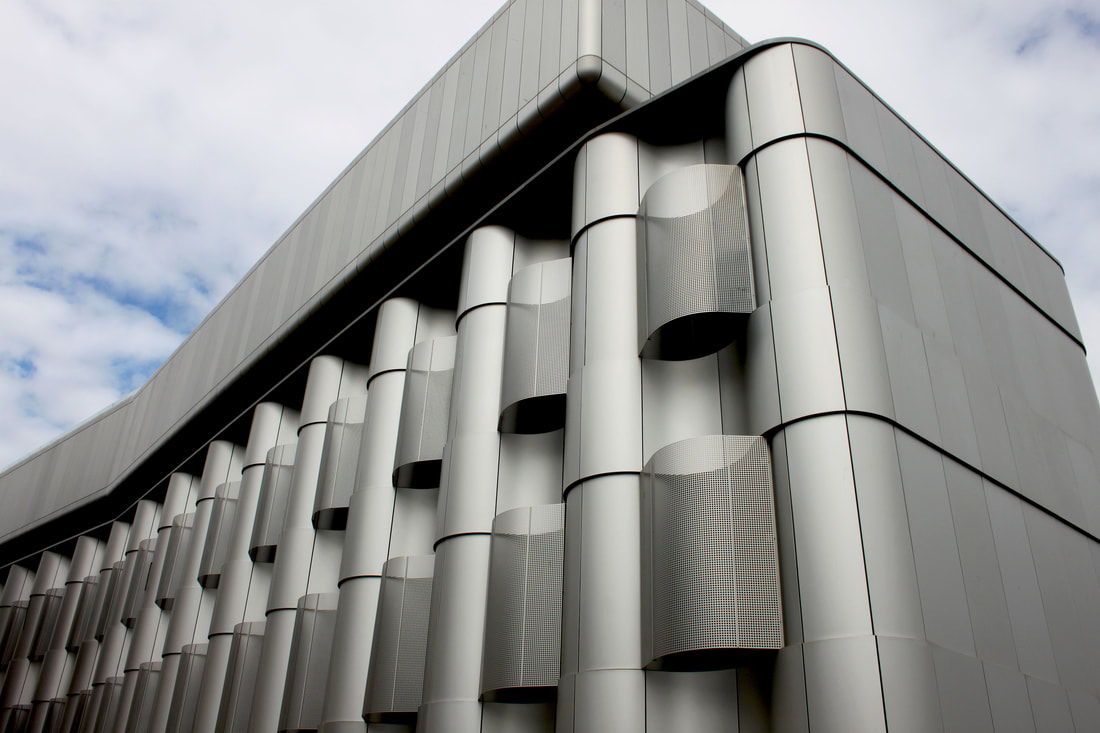
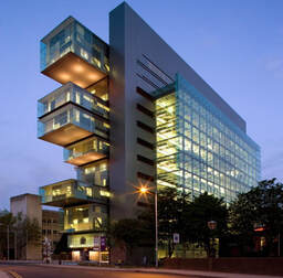
The form and structure of this building caught my eye. Its cold, metallic curvatures made it unique and completely unlike any other building in the city I had seen. The repetitive structure and striking, steel surface gave it a futuristic look. This building is part of the University of Bristol and is clearly a lot more modern than all of the other architecture. For my next shoot I think I will be focusing more on structures like this.
|
|
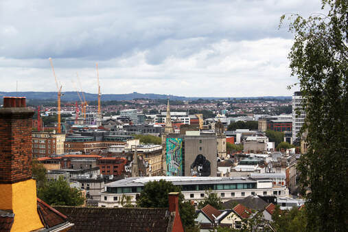
These are both landscapes I took of the city's skyline. With not many high rise buildings, Bristol's cityscape is made up of two or three-storey houses and grand, classically-featured buildings. The pastel-painted stucco of the houses gives the city a distinctive, period look.
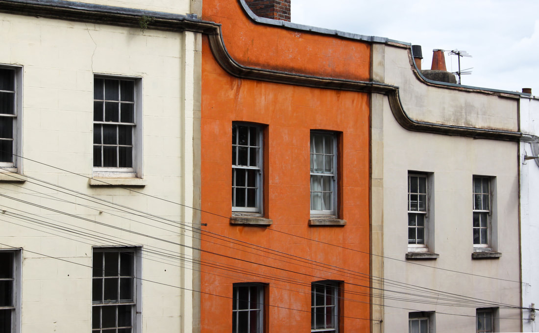
To enhance the orange in this image I increase the saturation and contrast. This made the orange section of the photograph more prominent making the image more ascetically pleasing.
|
|
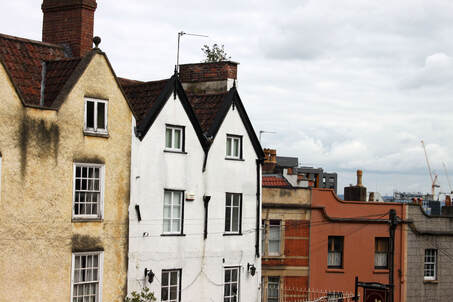
In these photographs, I focused on the imperfections and the effect if had on the overall image. In the first picture, I chose not to edit out the black imprint on the first house and in the second image I explored the impact of the graffiti on the wall. I think these "imperfections" added more life to the otherwise dull and repetitive housing.
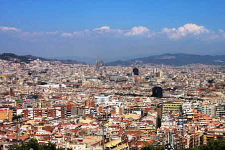
Shoot 2 - Barcalona
History of Barcelona
|
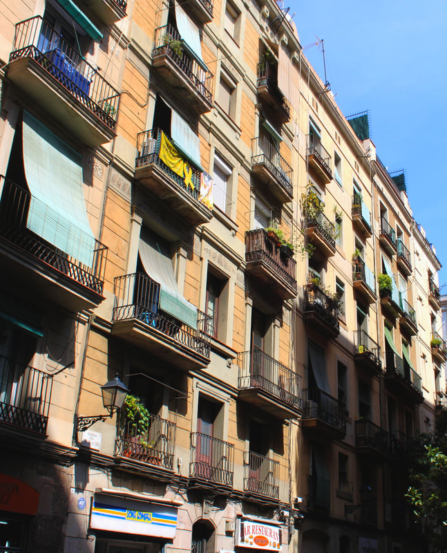
Barcelona was founded by the Phoenicians and the Carthaginians and the first human settlements in Barcelona date back to Neolithic times. More recently, the modernist designs of architect Antoni Gaudi have given Barcelona its trade-mark architectural style. To the present day, Barcelona is renowned for its art and culture and in particular, its stunning architecture.
The two most significant styles of architecture in Barcelona are Catalan Gothic, a medieval style, and Modernisme. The architecture can be described as bold, colourful, and unique as it successfully blends the old and modern buildings in one city. |
|
|
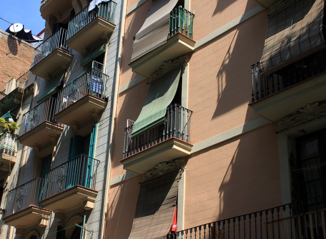
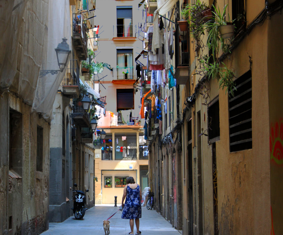
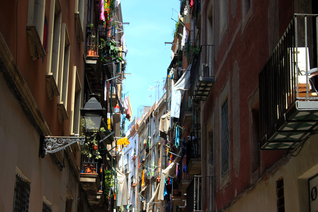
These images were taken in the streets of Barcelona. I tried to capture an everyday side to Barcelona by focusing on the ordinary on these images. The narrow streets had a warm feel to them as everyone seemed much more in touch with the community in comparison to London where everyone seems busy in their own lifes. The laundry hanging over the balcony added colour the the image and also to the community effect.
|
|
|
"Artist and me"
|
|
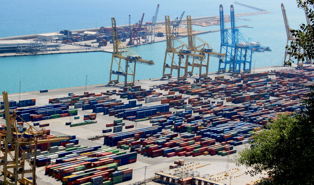
When capturing these images in Barcelona, I took inspiration from photographer Andreas Gursky. Although I did not digitally manipulate the photographs to enhance certain features (Gursky's style), the theme of an overwhelming mass of objects or buildings still appears. In Gursky's photographs the viewer is often made to feel as if they are unable to comprehend the repetitive structure of the image. I tried to mirror that feeling in these images to experiment with this style of landscape.
Andreas Gurskys's photographs:
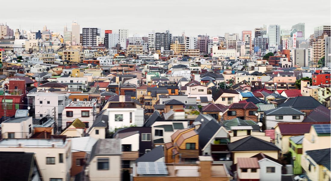
Andreas Gursky / Tokyo 2017
|
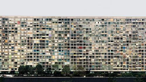
Paris, Montparnasse from 1993 grafts multiple images of a housing estate into a vast panorama
|
Gursky uses digital manipulation to clone parts of the image and paste them into one singular photograph. The technique has made Gursky's images easily recognisable. By comparing my work to Gursky's, I noticed his have more of a surreal feel, especially the housing estate in Paris. This is due to the fact that he has grafted parts from other sections so when looking at the image as a whole, you see parts repeated. It plays with the viewer's perception. Even though my images haven’t been digitally enhanced in this way, the mass of repeating rows of transport containers echoed a similar theme to Gursky's images which is mass consumerism.
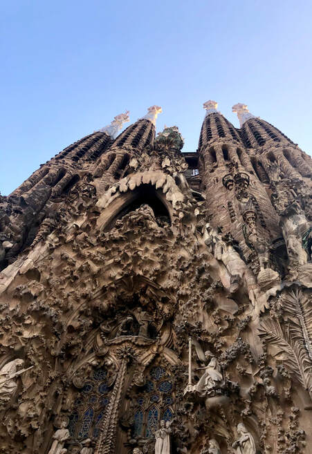
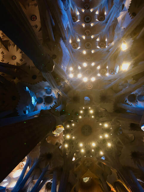
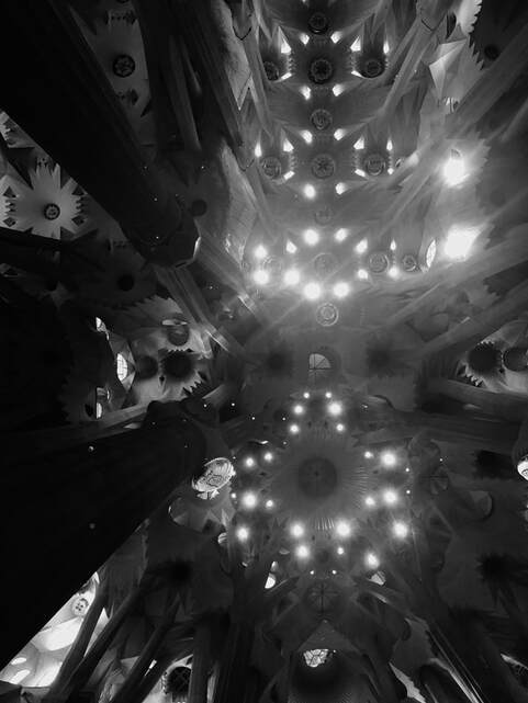
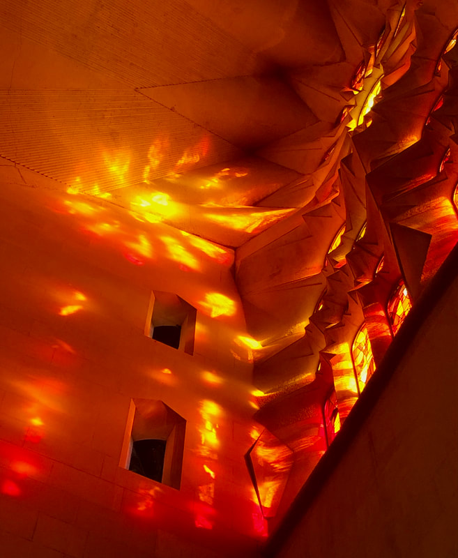
La Sagrada Familia
|
|
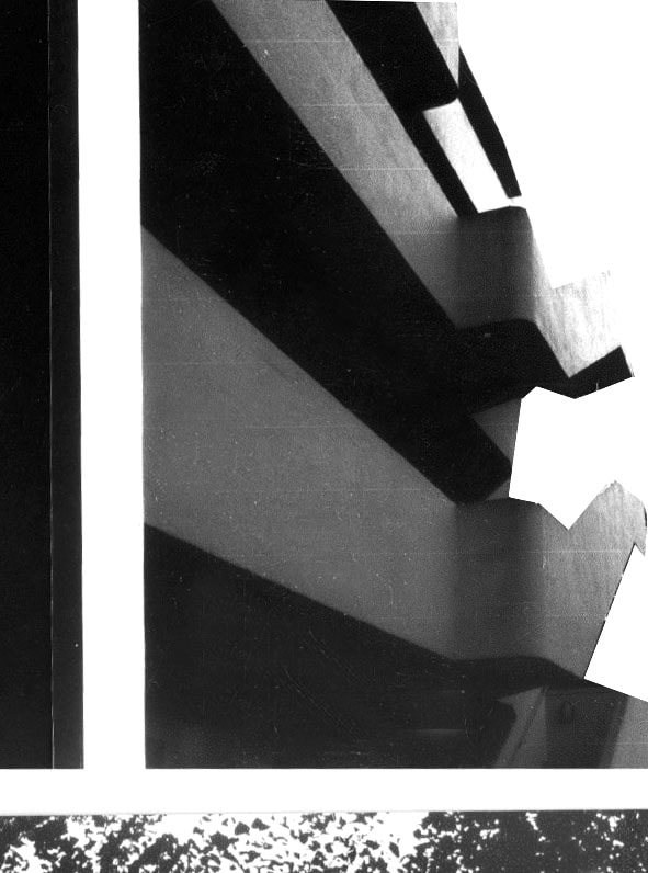
To this day, the cathedral is still under construction which is understandable considering the detail put into the ceiling. The pillars holing up the building mimic the trunks of trees in the rainforest and even the lights are incorporated in the shape and form of the structure. The edit of the image in black and white gives a different effect as it highlights the shadows of the buildings. Overall the structure seems to be influenced by nature which i intent to research in the future. The variety of shapes and forms in architecture fascinates me and how the contribute to the construction and function of the building. I believe the cathedral way build to replicate the natural environment to relfect the spirituality and peace of the untouched.
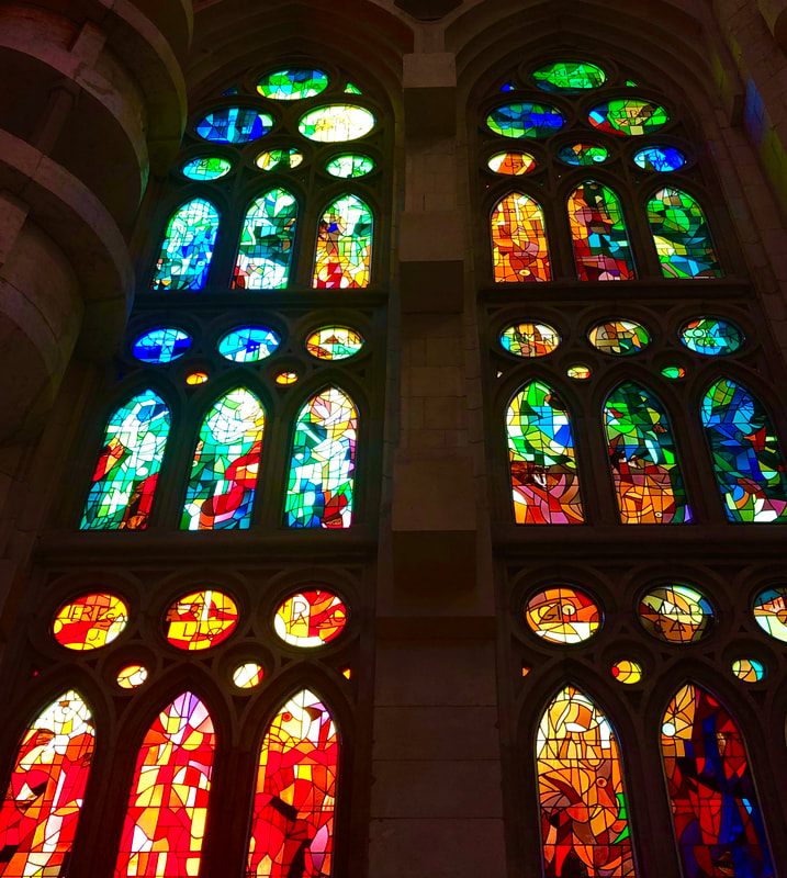
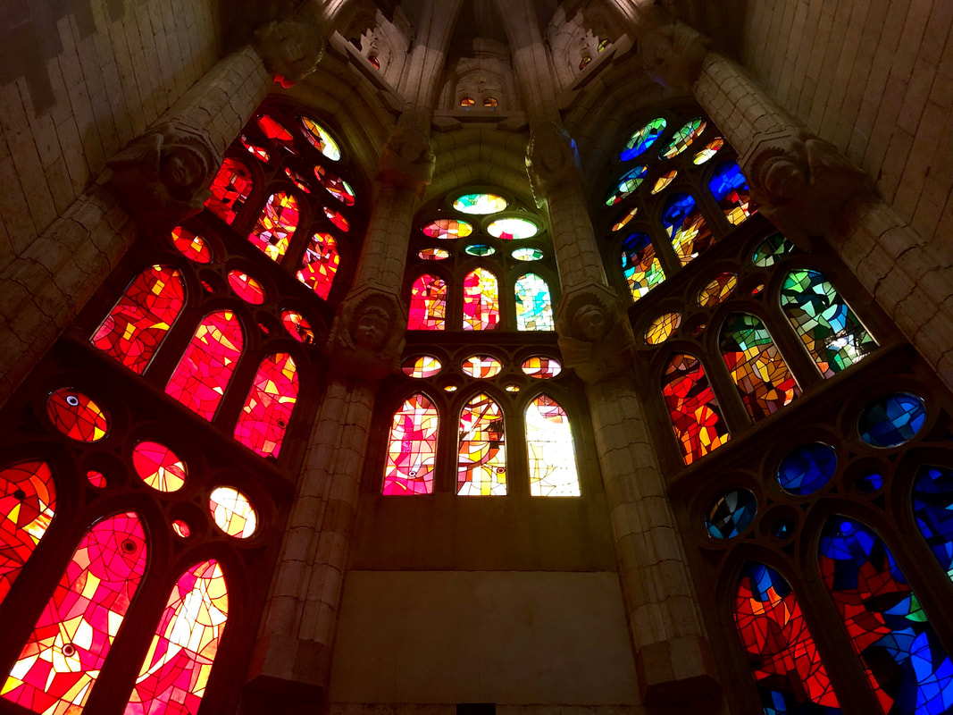
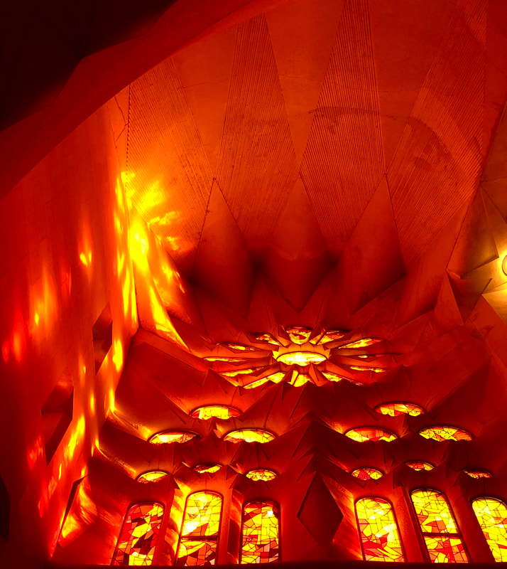
The beams of the sun created bright orange reflections through the stain glass window which enhanced through adjusting the contrast and levels. Architect Antoni Gaudi took natural lighting into consideration when designing the cathedral which is why he installed many stained glass colourful windows. The whole cathedral glistens in a magical way which allows people of all faiths to feel appreciated.
|
|
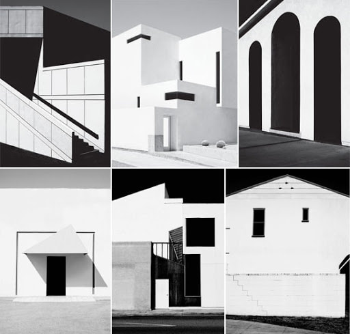
Shape and form in archetecture
Form is at the heart of architecture; it is not just simply the shape of a building but it comprises many elements like point, line and volume. There is a seemingly endless range of forms that inspire modern architecture: regular forms, irregular forms, regular and irregular, organic, forms inspired by nature and geometric .
- Regular forms are usually found where one or more than one element is repeated in the design. Such designs were made in order to merge easily with the existing skyline. There is no drastic effect on the surroundings and is more pleasing in the eye of the viewer.
- Irregular forms include parts/elements of irregular shapes which are dissimilar from one another. The overall effect could seem chaotic to the viewer however such architecture can be appreciated through its unique and intercut structure. Many respected designers including the respected and award-winning architect Zaha Hadid, incorporate much of this kind of form into their work.
- Regular and irregular mix form is a merge of both regular and irregular forms of architecture. The contrast makes a very appealing building all together and the form of the design makes a building look completely different during all the previous stages.
- Forms inspired by nature is when designers and architects take inspiration from nature. These types of forms are not about replicating the natural form but more about understanding the rules governing the form behind structure.
- Unusual forms can vary from a building shaped like a random object to a very unusual structure that you would not normally find in architecture. This type of design goes against all regular and inspired by nature forms and structures by standing out in its environment and intentionally looking out of place. It draws people in by standing out from its surroundings.
- Geometric forms are the result of formulas generally seen as the ideal proportion and epitome of aesthetics. They can have regular forms intertwined in their structure and repetitive shapes. This could be seen as the best mix of all the different forms.
Regular forms
Unusual forms |
Irregular forms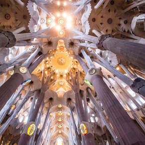
Forms inspired by nature |
Regular and irregular mix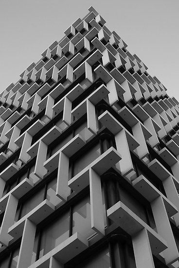
Geometry And Architectural Forms |
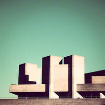
Brutalism
The word "Brutalism" in relation to architecture was first used by a Swedish architect, Hans Asplund, to describe a square brick home called the Villa Göth in 1949. This was later picked up by English architects during the mid-twentieth century, post world war two as the country was going into an economic depression. Due to the mass destruction of architecture in communities from bombings, the government turned to Brutalist structures as they were inexpensive to construct. A range of different buildings like low-cost housing, shopping centres, and government buildings were reconstructed in Brutalist style which made them stand out in the city from the other buildings constructed in older time periods. In modern society, many architects still choose the Brutalist style even with large budgets, as they can be appreciated through their sculptural qualities. A lot of Brutalist architecture received a negative response from the public almost as soon as it debuted. To the public, the buildings were cold to look at and an ugly reminder of the war. However, the governments intent was for the new concrete architecture to represent postwar possibilities. Often, bomb-damaged buildings were left to just slowly crumble because the only thing more expensive than properly maintaining them was tearing them down.
Examples of Brutalism in London
|
|
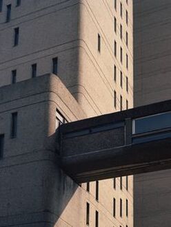
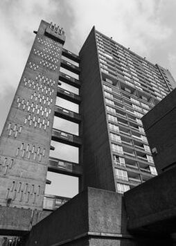
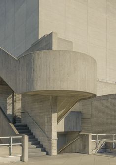
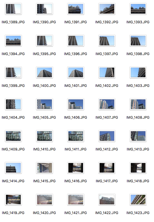
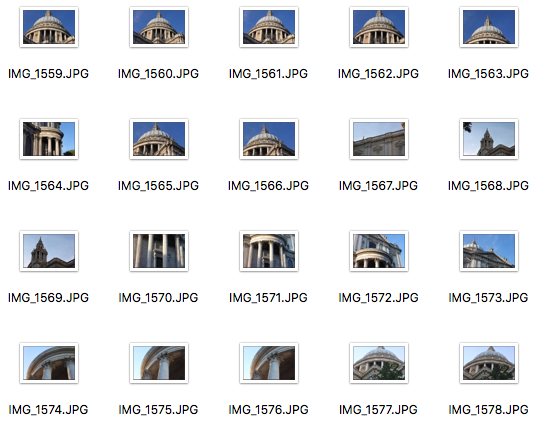
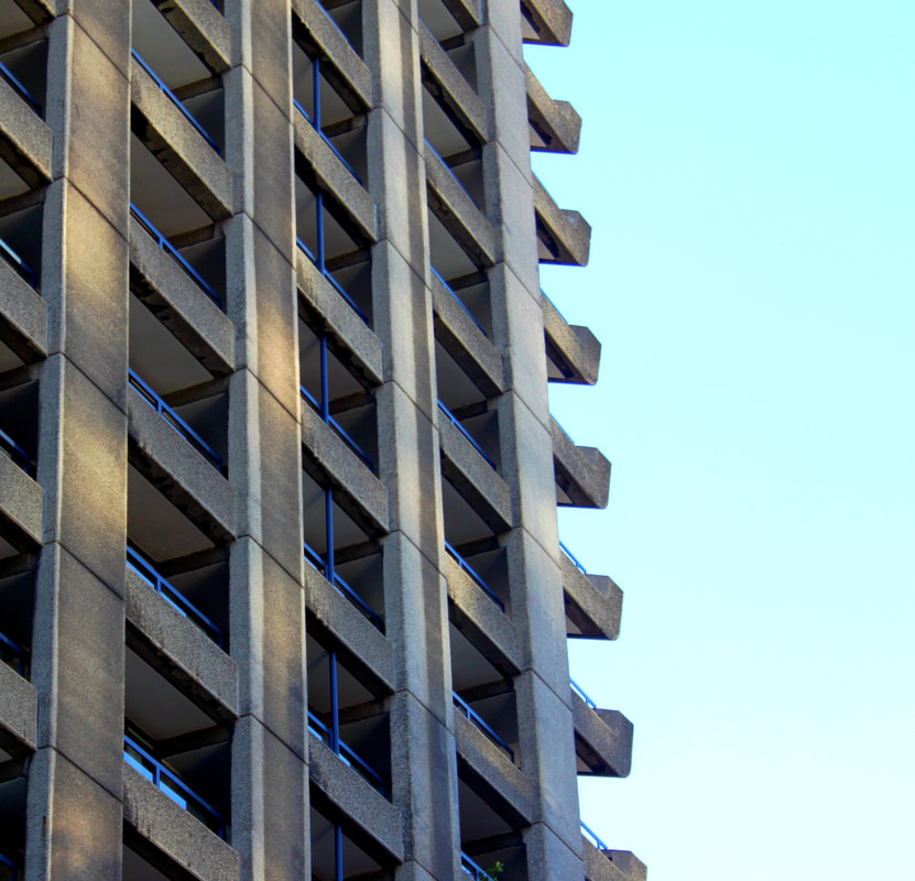
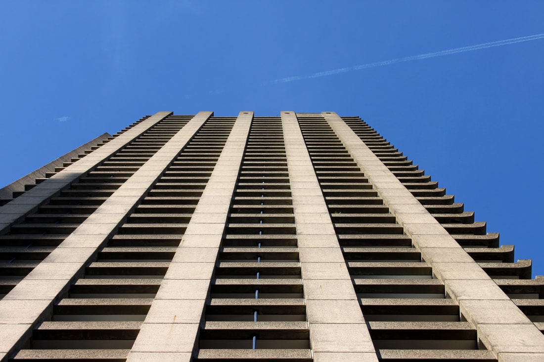
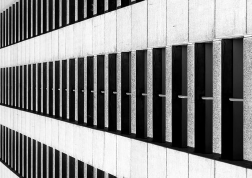
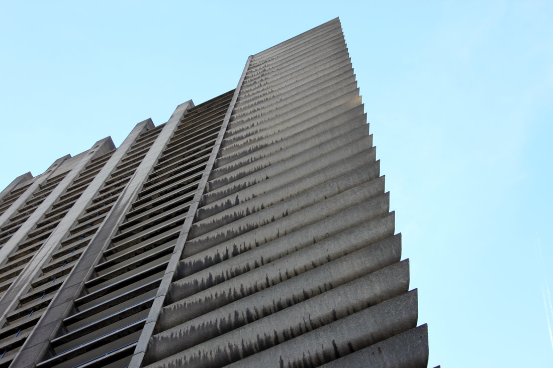
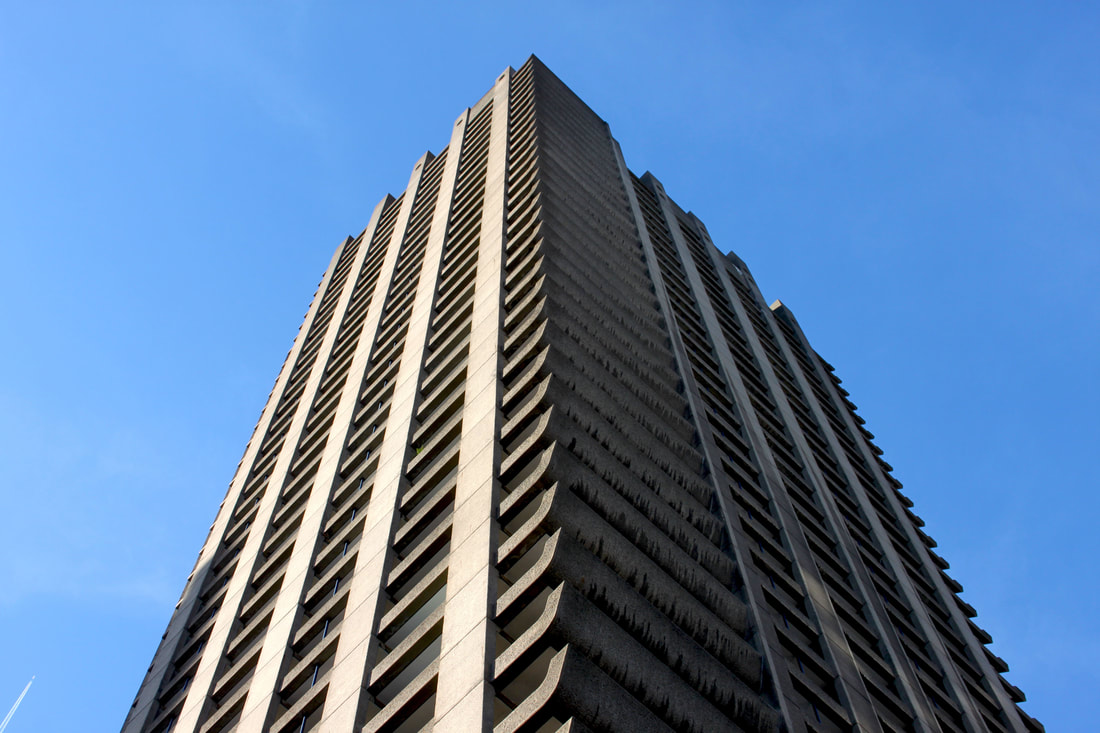
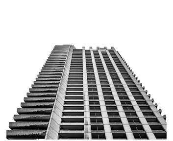
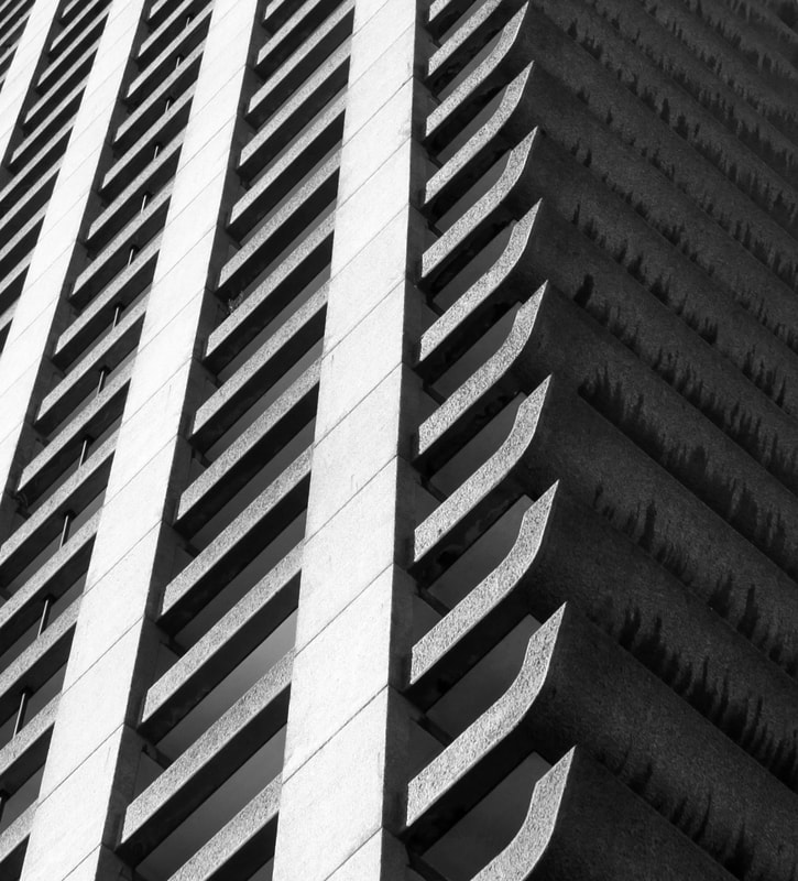
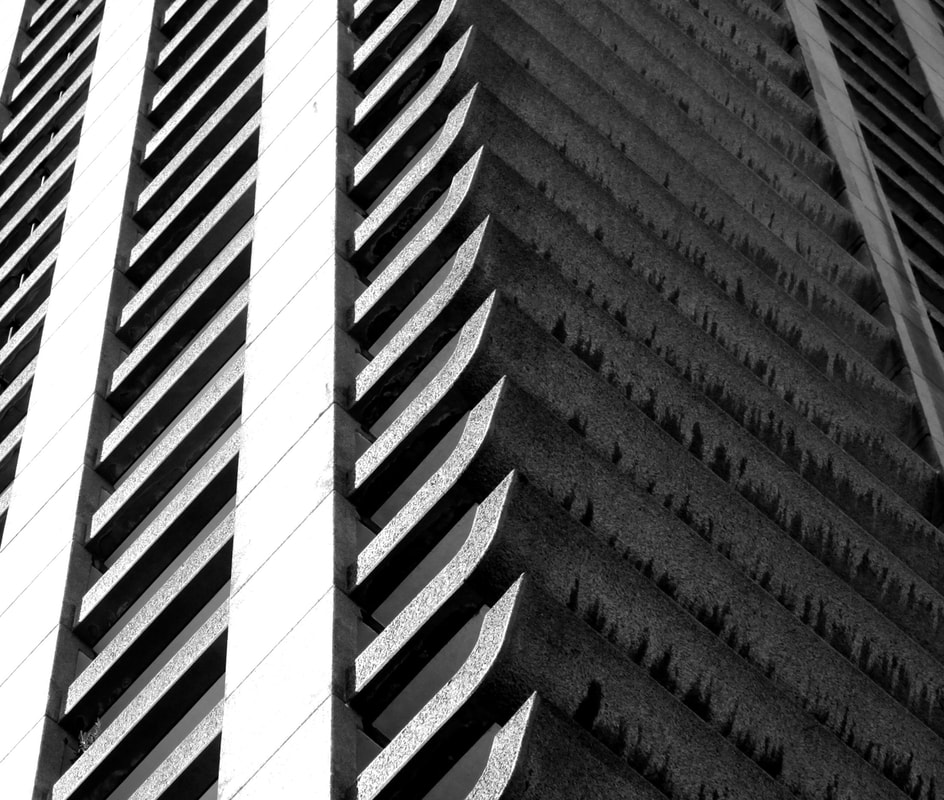
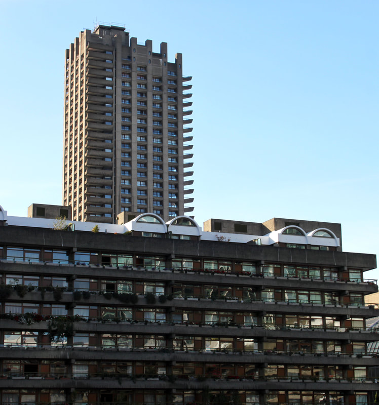
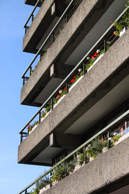
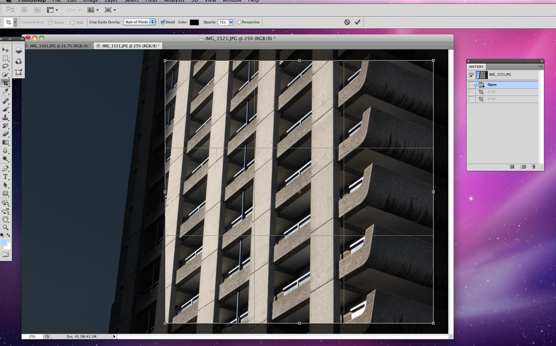
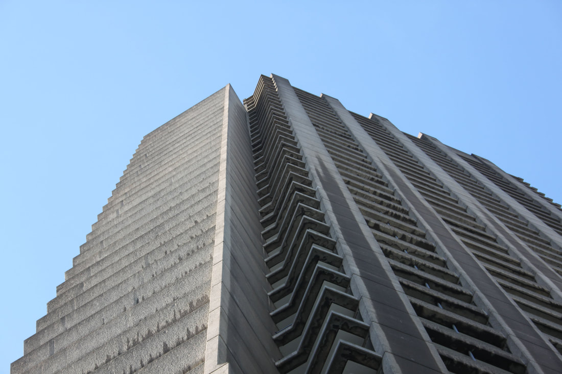
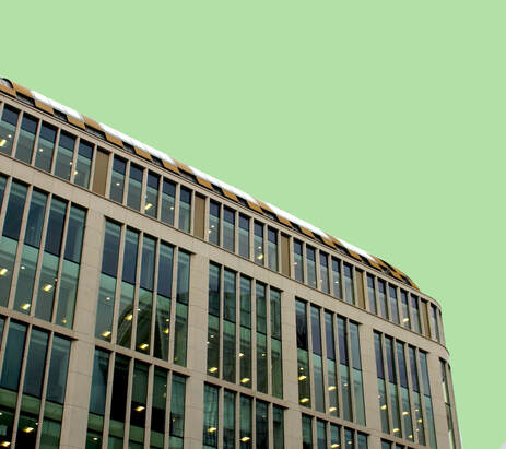
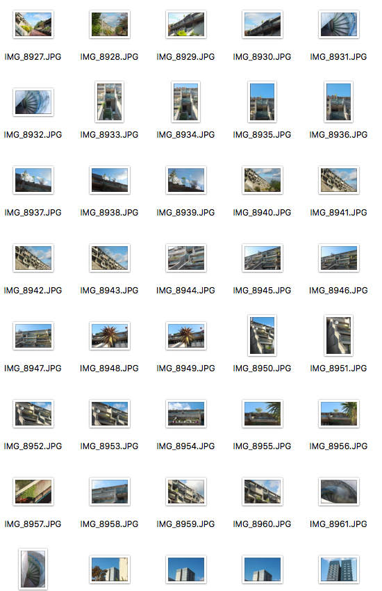
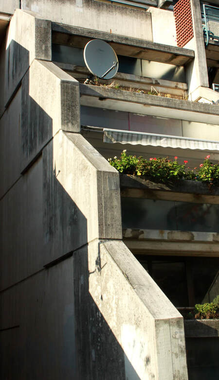
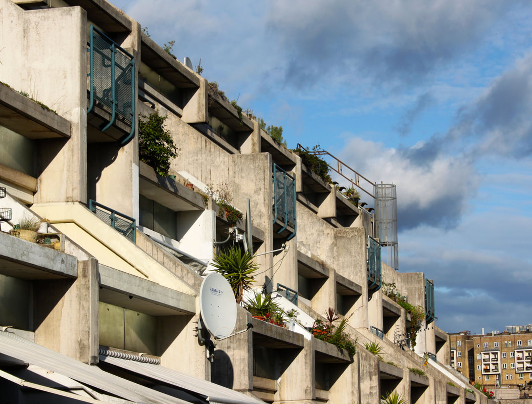
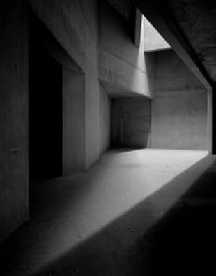
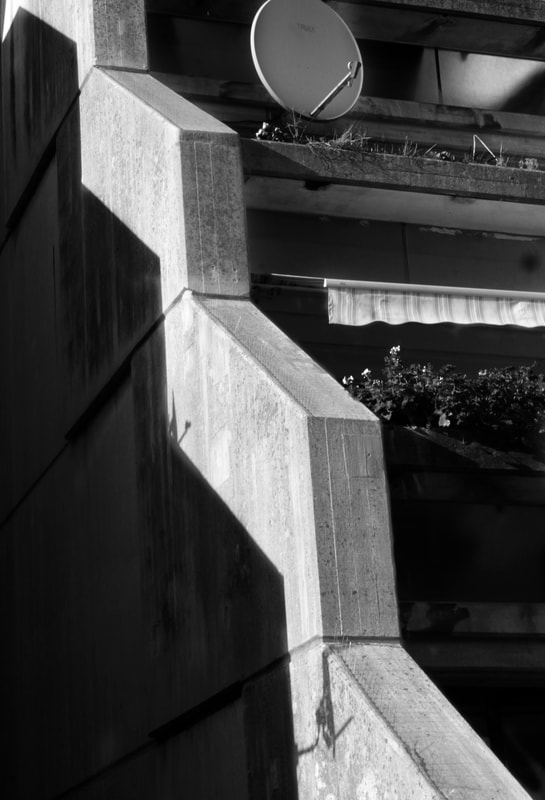
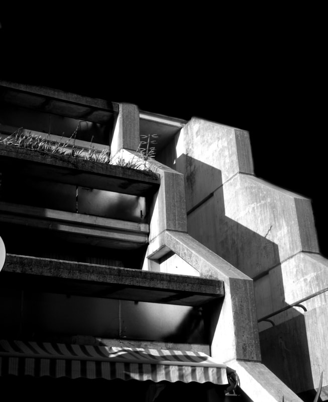
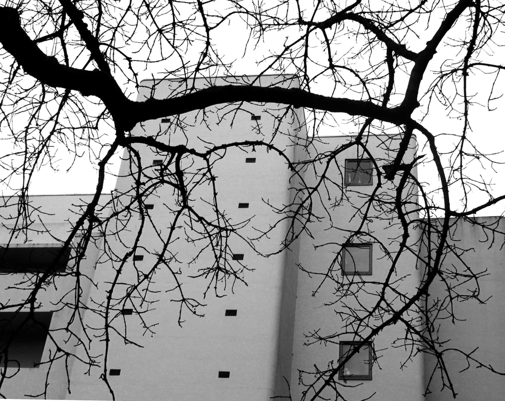
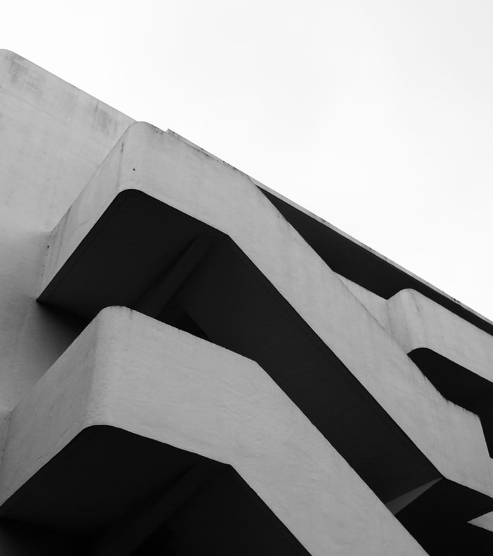
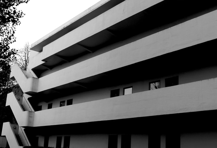
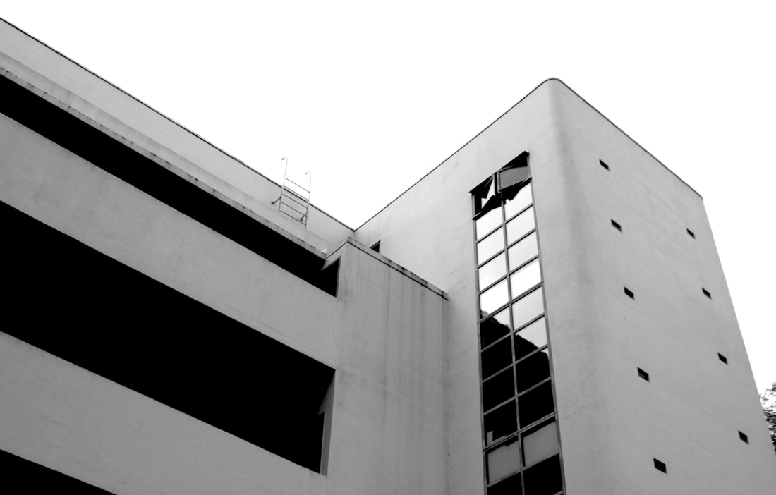
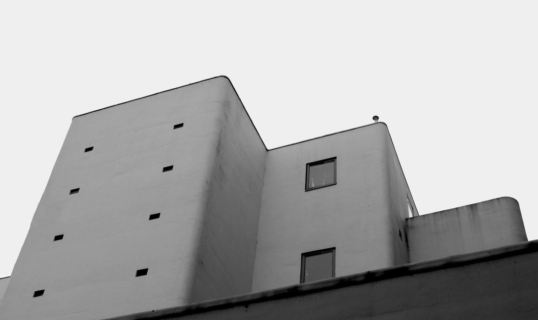
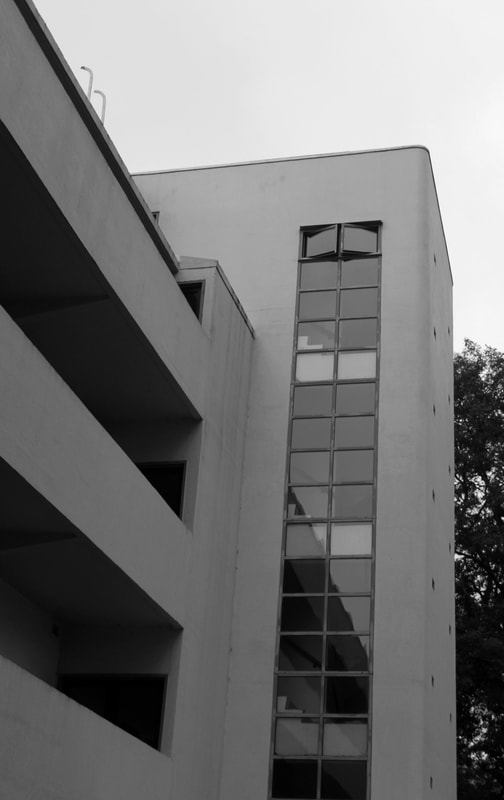
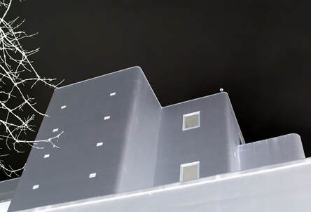
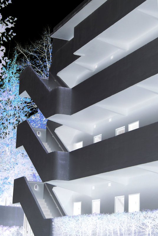
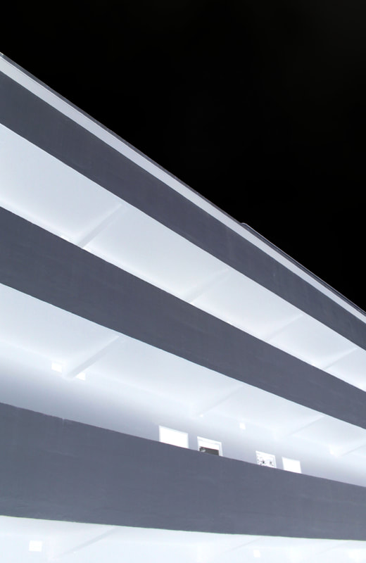
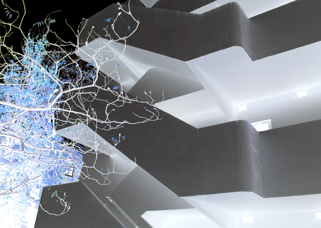
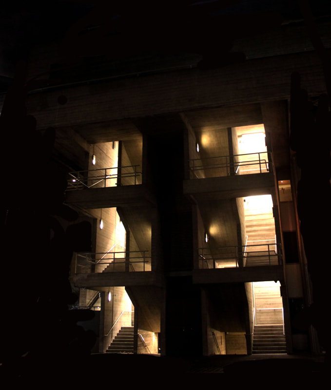
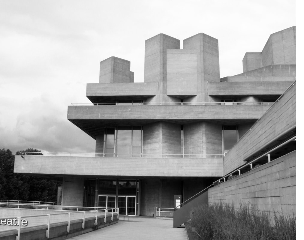
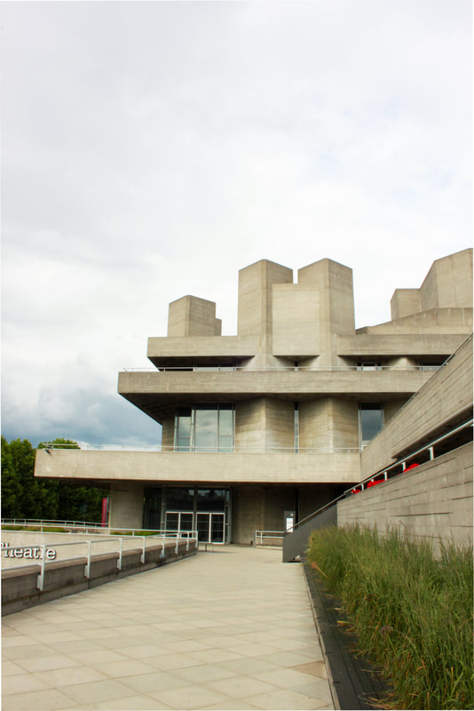
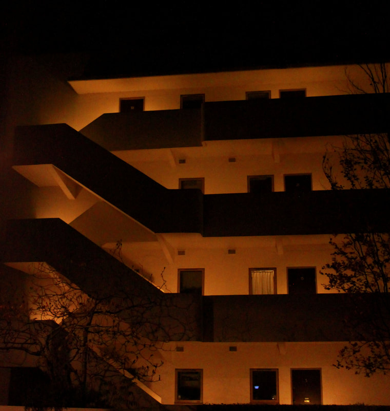
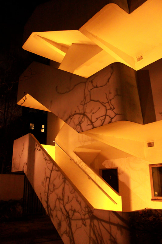
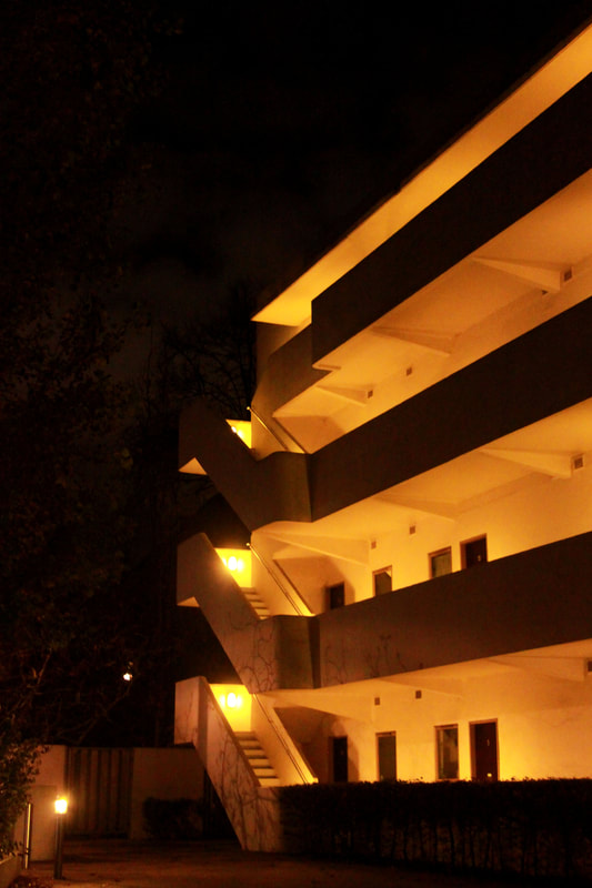
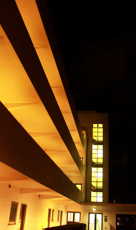
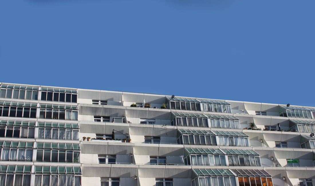
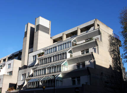
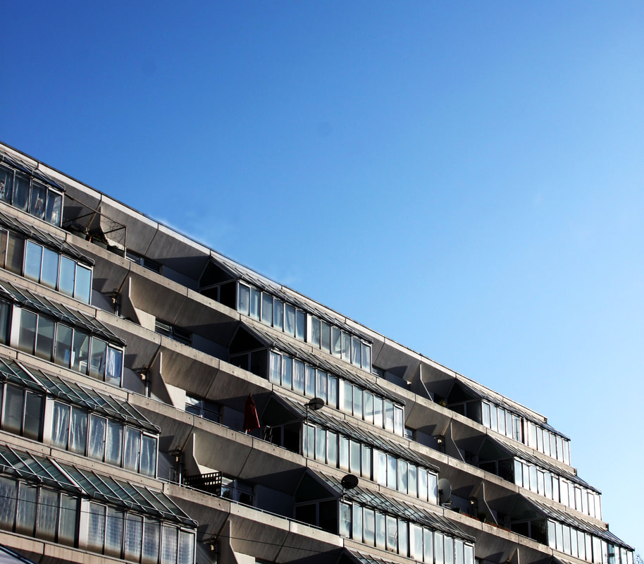
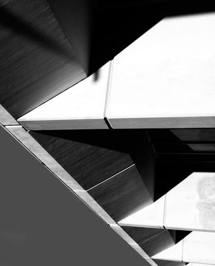
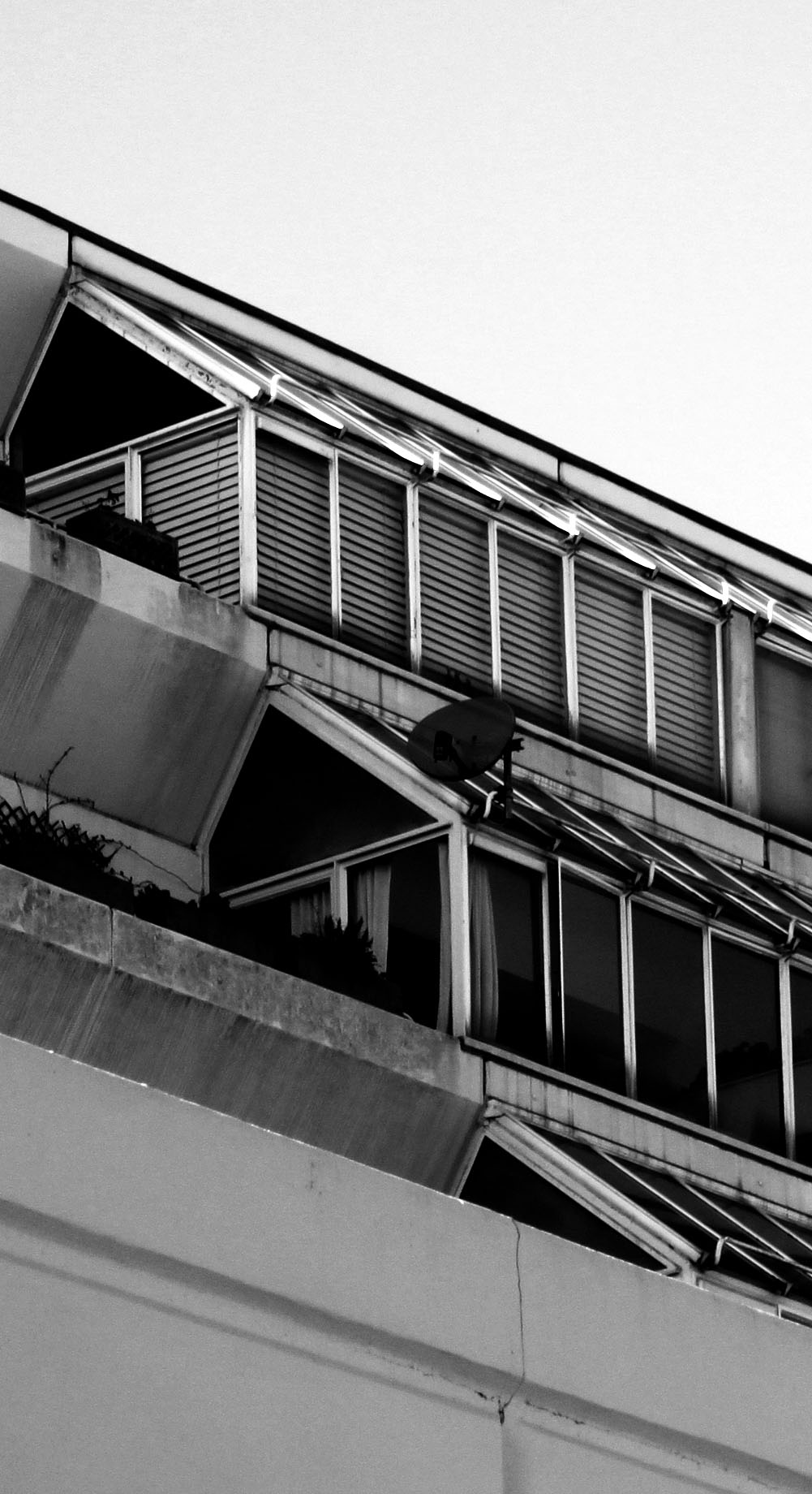
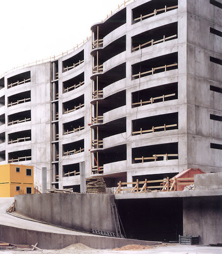
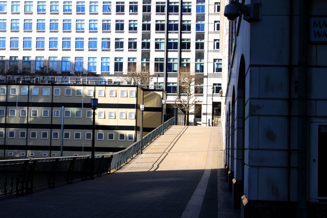
Shoot 3 - The Barbican
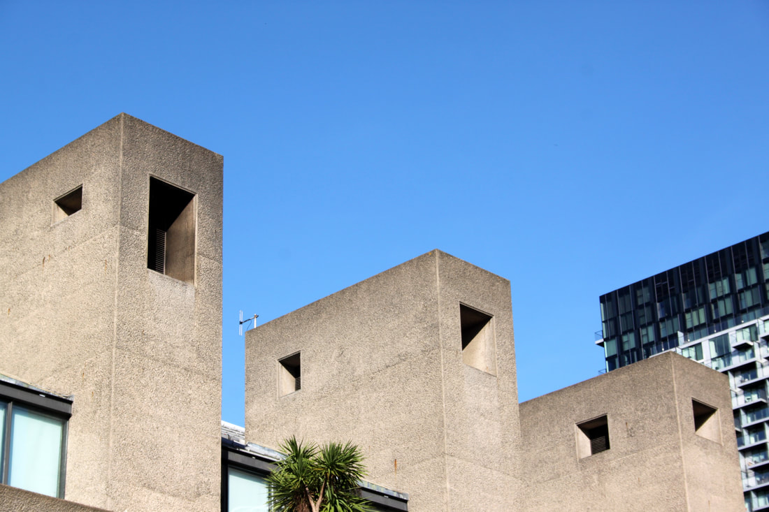
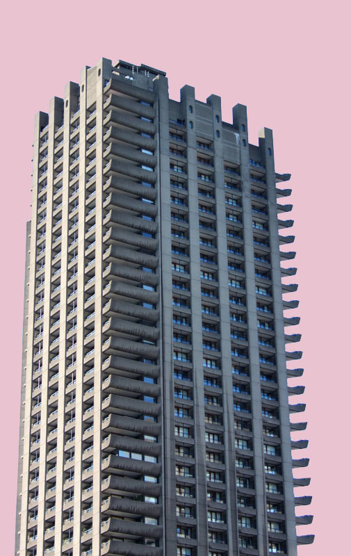
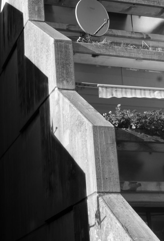
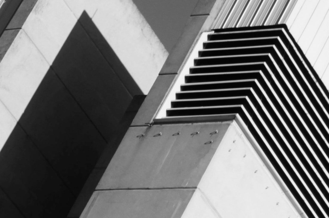
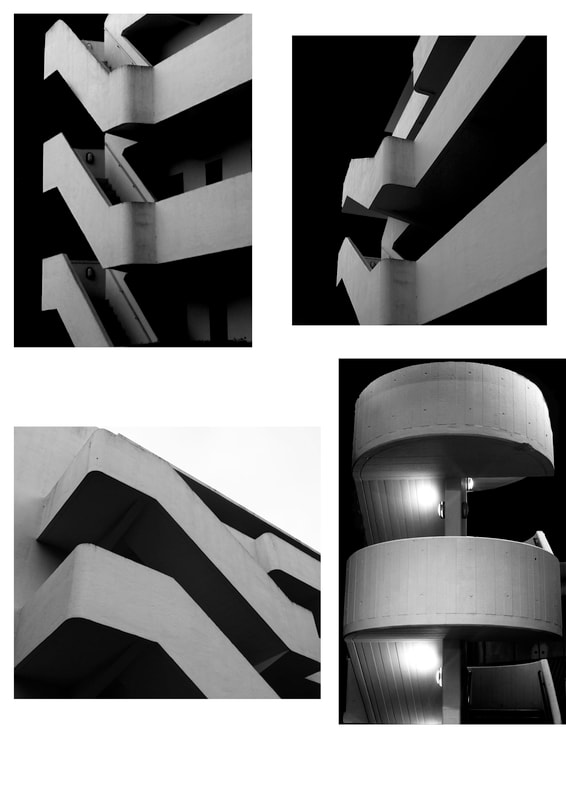
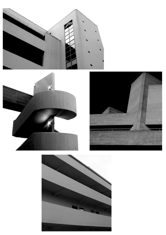
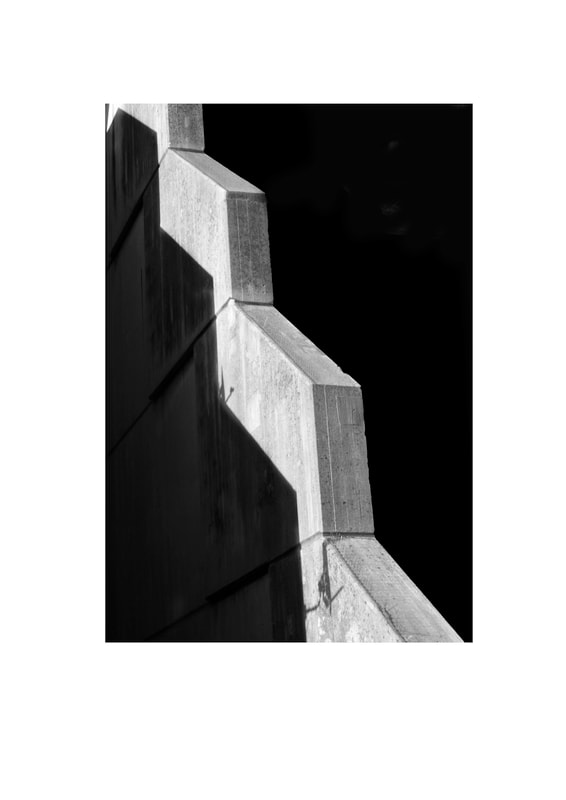
I photographed the Barbican to try to capture the shapes within the architecture. The Brutalist structure contains strong lines and hard concrete which creates a powerful image. As one of the largest Brutalist structures in London, it defiantly stand out amongst the cityscape. As it is such a big complex, there are many dissimilar parts to photograph which is what makes the barbican so unique.
|
|
The Barbican history
|
The Barbican was developed by architects Chamberlin, Powell and Bon with the hope of transforming an area of London left destroyed by bombings during the Second World War. The team of three architects had recently established their reputation by winning the the 1951 Design Competition for the nearby Golden Lane Estate so took on the challenge of building what is today one of the most renowned Brutalist structures, world class art centre and home to many. 'Barbican' used to be the name of the street which in 1940 was bombed during the Blitz: the area around the Barbican was flattened due to rapidly spreading fire caused by bombing.
Before the war, the area was the centre of business for merchants trading in fabric, leather and fur. Designs for the Barbican were finalised in 1959 and construction extended through the 1960s and 70s. After over a decade of construction, the Barbican Centre was finally completed in 1982 and was opened by The Queen. She declared it to be ‘one of the modern wonders of the world’ with the building being seen as a landmark in terms of its scale and ambition. The building was set out to be a car-free realm, raised up over the city's streets, allowing both visitors and residents the freedom to explore the area on foot. |
|
Edited images
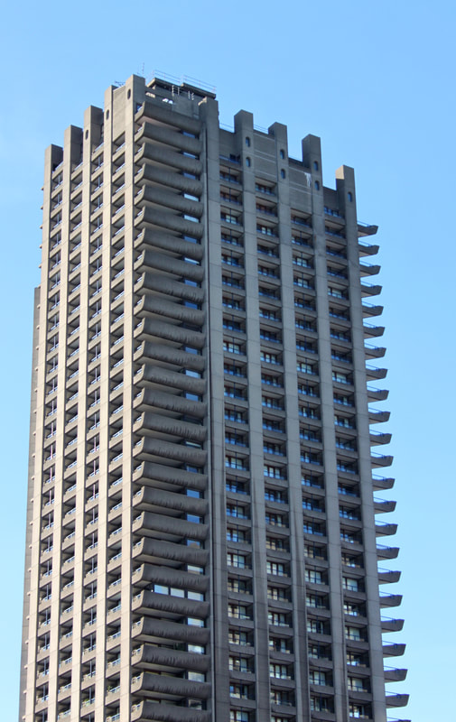
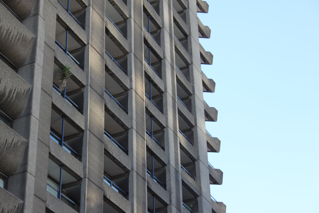
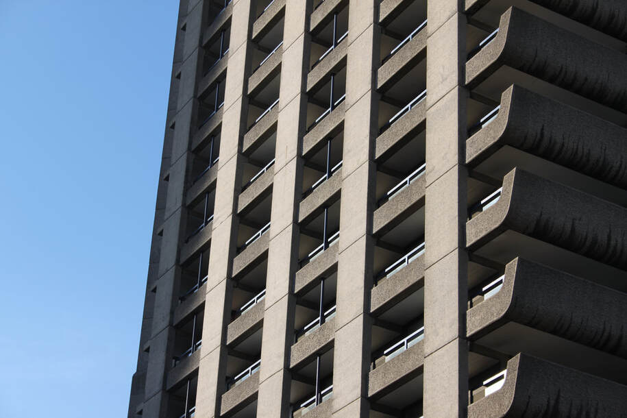
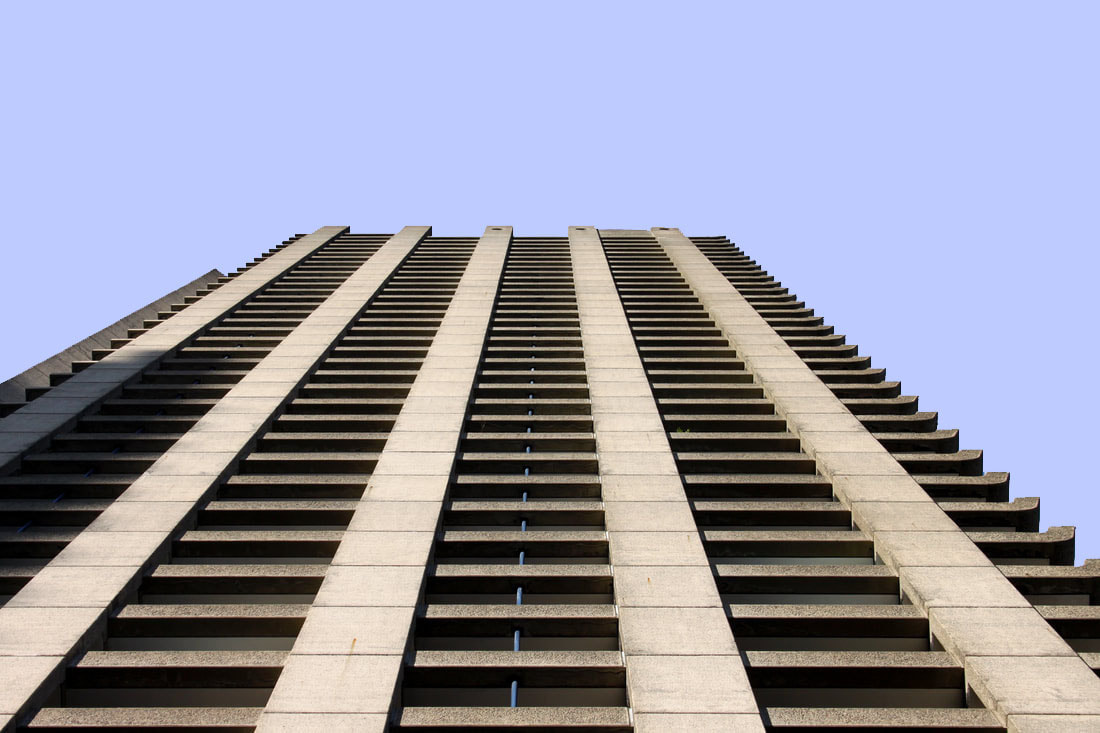
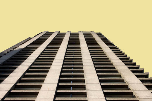
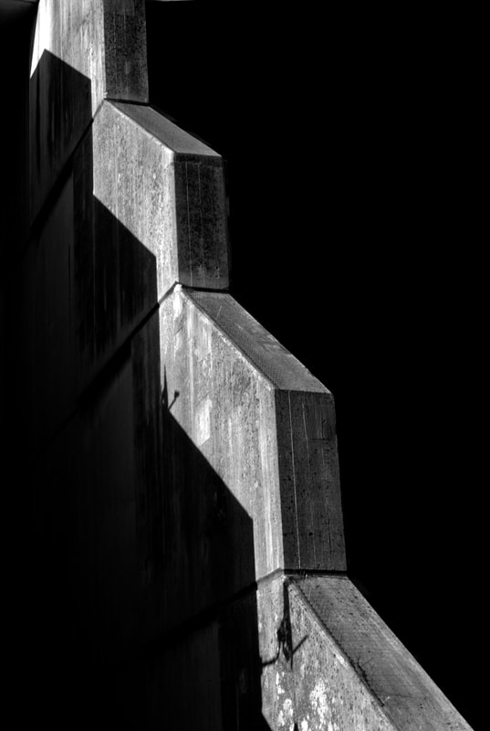
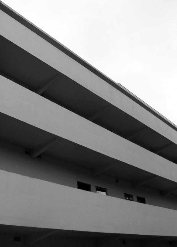
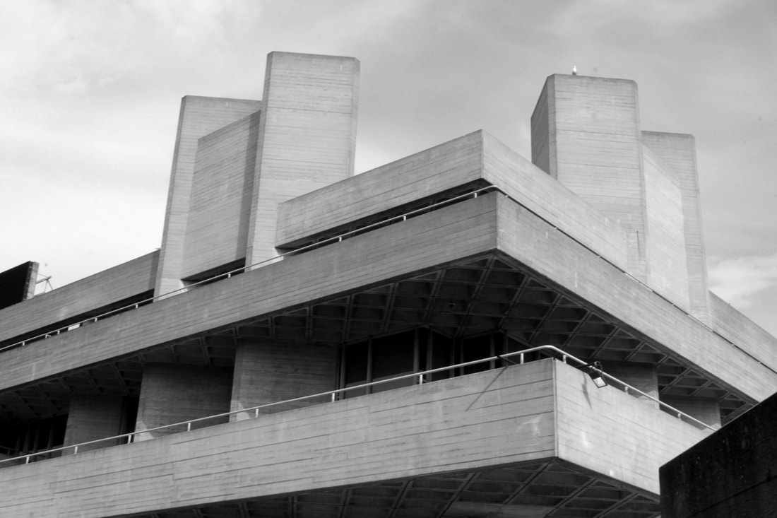
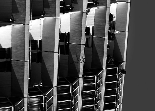
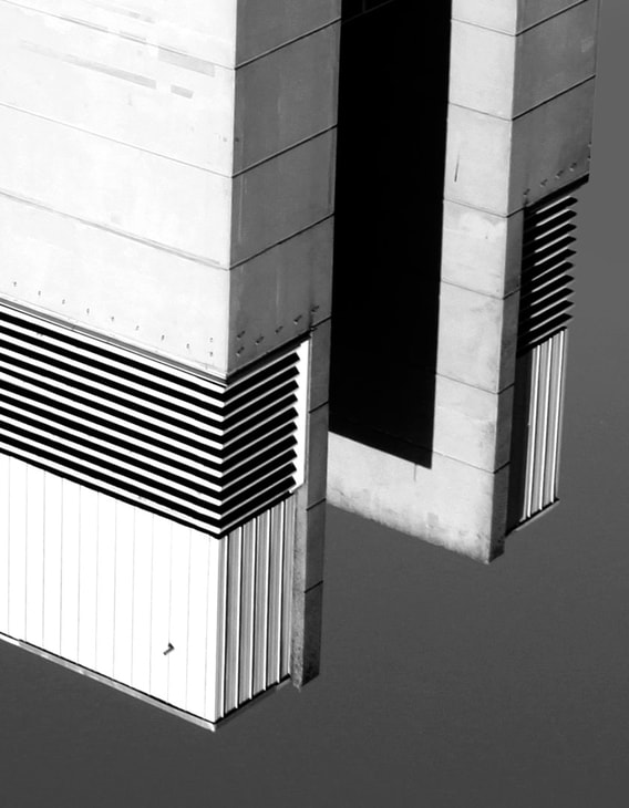
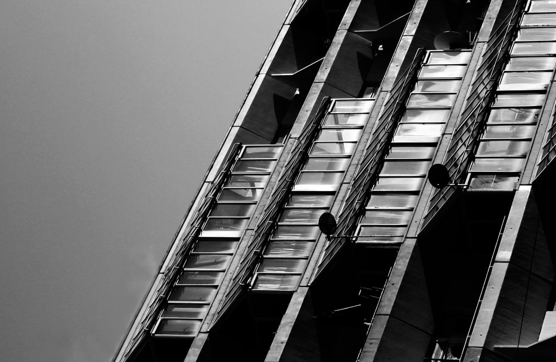
This image shows the repetitive structure of this high-rise section of the Barbican's Brutalist architecture. The blue of the sky complements and contrasts with the concrete structure. As the sun shines on the left part of the image, this brightens up and creates a shadow on the building which then produces a more pleasing, balanced image. The absence of people in these images forces the viewer to focus on the shapes and structures created by the architecture rather than considering the stories behind the lives of the people who might live or visit here.
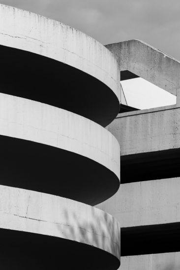
When editing this image, i considered what would draw the most attention to the structure so i cropped out the buildings surrounding to create an image which looks more abstract. For each concrete curvatures sweep upwards, a person or family is represented which gives a sense of individualism. However, as they all aline with each other and are connected this creates a sense of community which is defiantly felt in the streets of the barbican.
When editing this image, i considered what would draw the most attention to the structure so i cropped out the buildings surrounding to create an image which looks more abstract. For each concrete curvatures sweep upwards, a person or family is represented which gives a sense of individualism. However, as they all aline with each other and are connected this creates a sense of community which is defiantly felt in the streets of the barbican.
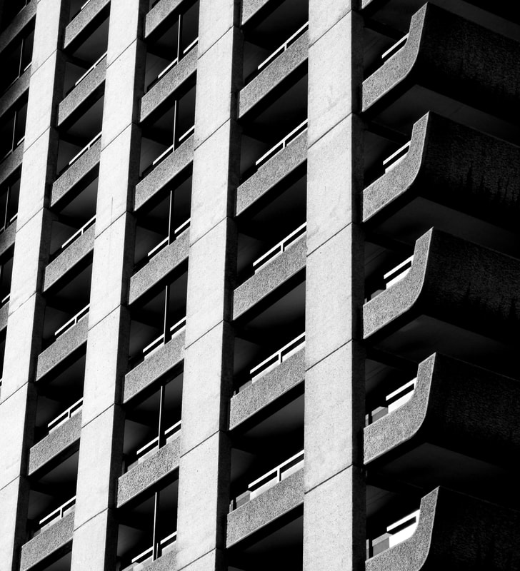
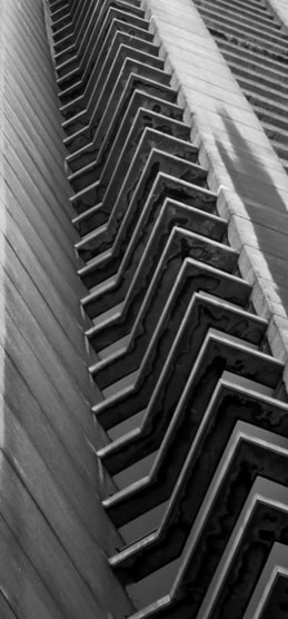
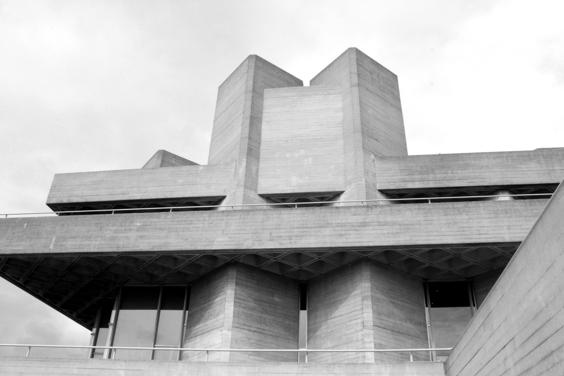
This close up highlights the repetitive pattern within the building. By cropping the image and adjusting the contrast in photoshop I was able to accentuate the contrast between the geometric shapes of the concrete exterior of the architecture against the open pale blue of the expanse of empty sky. The empty canvas of the sky allows the viewer to appreciate the sharp edges of the silhouette of the building.
|
|
|
|
I repeated the same technique with several different images, exploring the same concept with different building shot from differing angles. The edges of the same building set against the same backdrop when seen from slightly different angles created different shapes and effects. I edited the image by changing the colours to greyscale and then flipping the image 90 degrees. By editing the image this way I was able to create an image which highlighted the repetitive structure.
|
|
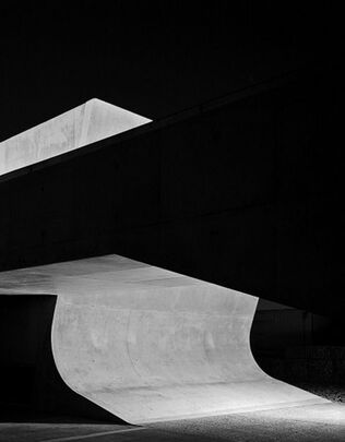
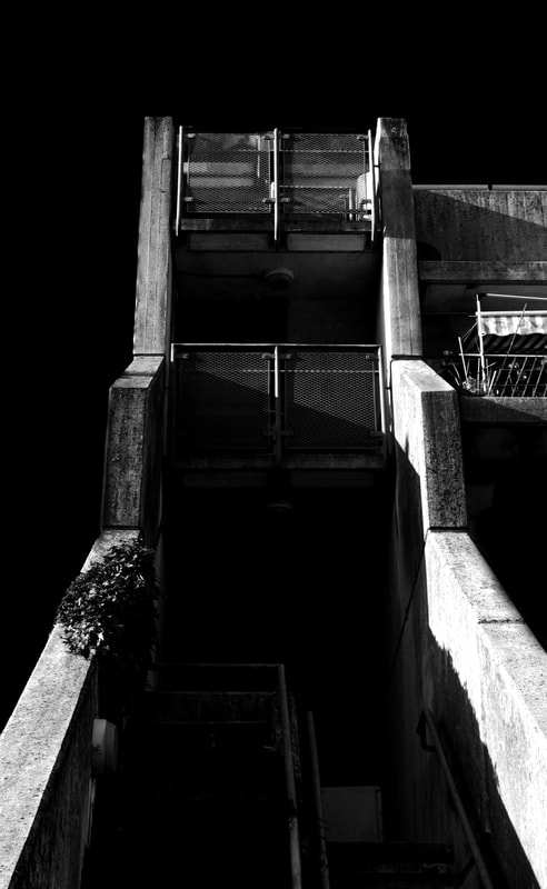
These images taken of the Barbican from below shows the overwhelming size of the Brutalist structure. Comfort can be found in the repetitive curvatures of the concrete. When looking at the building from this angle it looks more like an abstract sculpture rather than a place people inhabit. Although the edges are slightly curved, they still have a sharp form which gives the building its harsh look and feel.
|
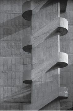
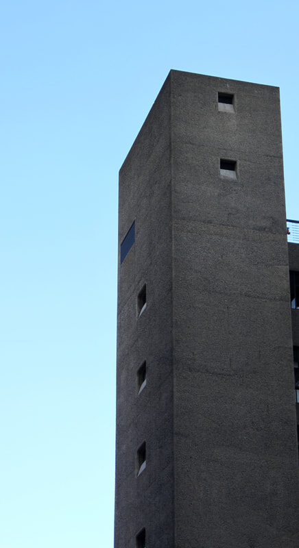
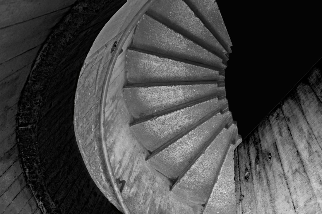
In these images I chose to concentrate on the texture of the surface of the buildings in these brutalist constructions. In these images the overall shapes are less of a feature than the lines and sections on the exterior of the buildings which reveal some of the secrets of how they were built. Faint lines etched across the surfaces show the sections and panels of concrete that form the underlying design of these buildings. I found it fascinating that these 'scars' told the stories of the origins of the buildings' designs.
|
Nick Miners
|
|
|
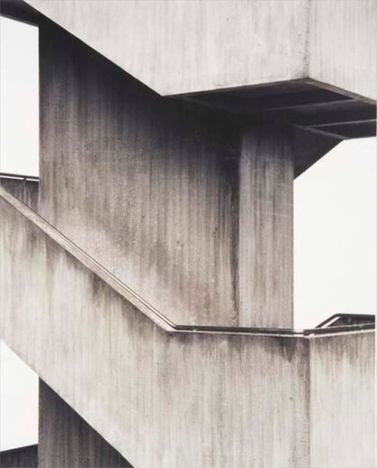
Nick Miners is an architect and photographer who is known for his images of buildings, in particular, Brutalist designs. As an architect, he understands the structure of the buildings better than most; this benefits his photography of architecture as he knows what angles will capture the buildings best and how to frame the image. He edits the images into black and white to draw attention to shapes and harsh lines. He also uses the technique of isolating parts of the Brutalist architecture to focus purely on the shapes. At other times he captures the building as a whole to present the repetitive patterns of the overall structure.
When photographing and editing images of the barbican, I attempted to use similar techniques to Miners. This was carried out by isolating certain parts of the structure when photographing, cropping images in photoshop to enhance shapes and editing the images to black and white.
When photographing and editing images of the barbican, I attempted to use similar techniques to Miners. This was carried out by isolating certain parts of the structure when photographing, cropping images in photoshop to enhance shapes and editing the images to black and white.
"Artist and me" - Nick Miners
|
|
|
In these shots, I slightly overexposed the works in order to lighten the shades of grey to white so that sections of the buildings and the pale grey of the sky as a backdrop would all fade closer to white. Also, I tried to darken the shadows to further contrast the difference between the lighter and darker parts of the images. This reminded me of the effects created by Miners in his works.
|
This picture was taken from inside the Barbican looking out. The window perfectly frames the image and scenery which contrasts with the harsh structure and ascetic of the building. The plants that hang down and invade the image add texture to the frame. When editing this image I focused on enhancing the colours of the tree and refections of the glass by increasing the saturation and contrast.
Editing process:
|
|
-Cropping the image
|
-Changing the colour to black and white
|
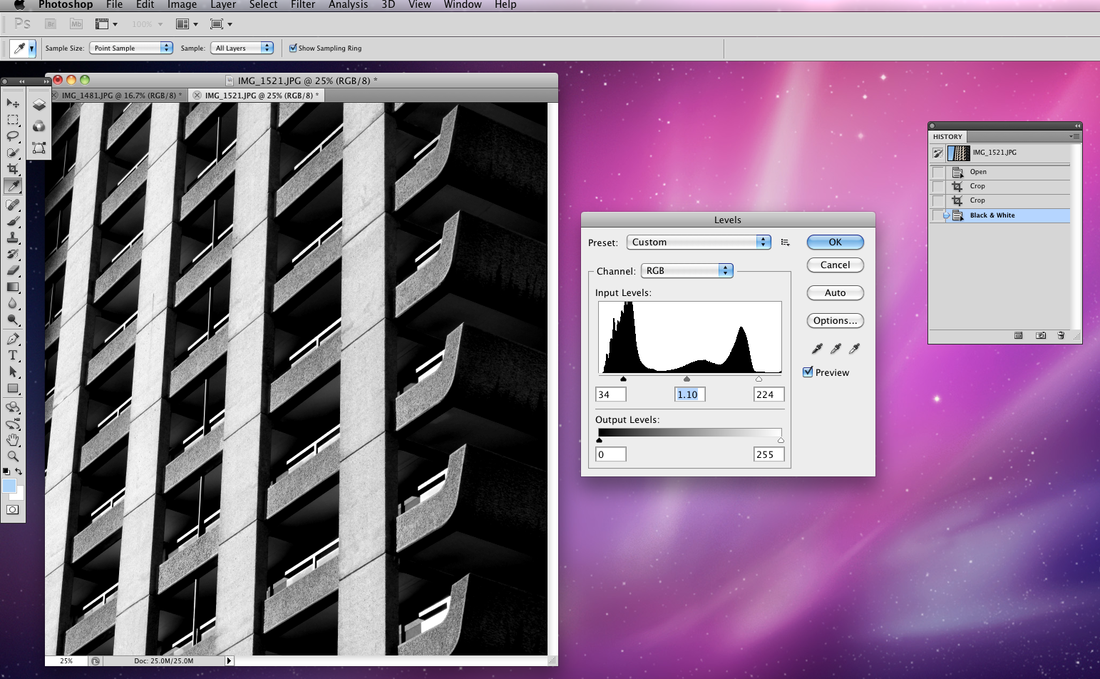
-Adjusting the levels
|
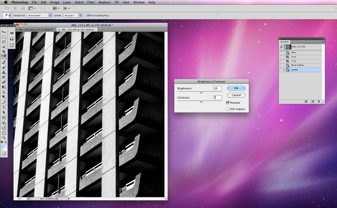
-Increasing the contrast and lowering the brightness
|
Editing process:
The original image displays the whole building with the negative space of the sky. I wanted to isolate the shapes within the architecture to create a different perspective. On photoshop, I cropped the image and made it black and white to further emphasise the shapes within the architecture. Then, I adjusted the contrast and brightness so the picture wouldn't be too dark.
|
|
-Cropping the image
|
-Changing colour to black and white
|
-Adjusting brightness and contrast
|
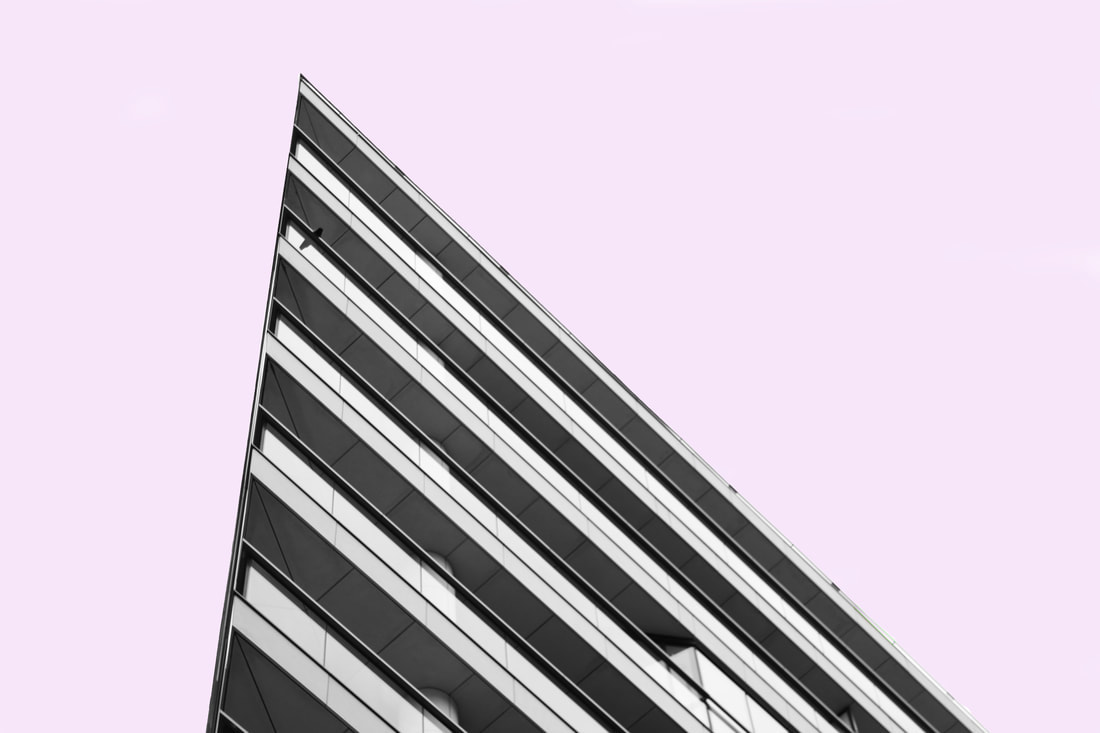
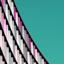
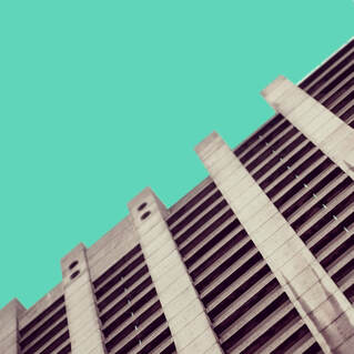
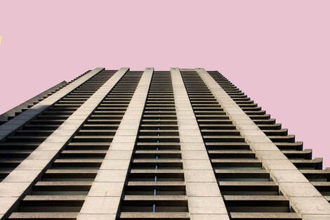
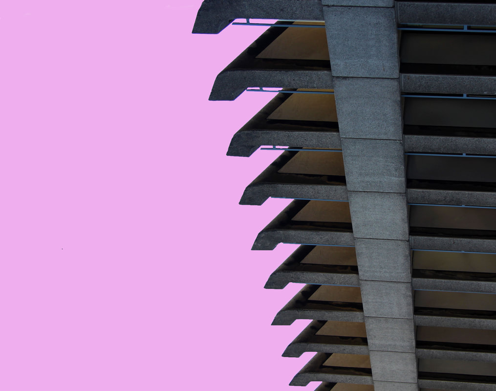
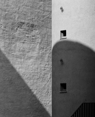
Nicholas Goodden
Nicholas Goodden is a London based urban photographer and cinematographer. He is known for his social media presence and was featured twice in the past two years in global social influencers lists. Goodden produces a lot of commercial photography for advertising which means he often experiments with bright, catchy colour schemes. What intrigues me about his minimalist series is the isolation of buildings from their natural surroundings. Bright, pastel colours are used to fill the negative space surrounding the image which sets a tranquil mood. The pastel colours, chosen by Goodden, complement the repetitive, grey structures of the buildings at the same time as reducing the image to contain solely that structure.
"When my focus leans towards architecture, I search for concrete buildings with repetitive elements, simple lines and designs. reducing appearance in the photograph to basic geometric shapes through careful composition." - Goodden explains what architecture he's drawn to: "repetitive elements, simple lines" relates to my work on Brutalist structures. These are common and significant features of the Brutalist buildings which I intend on focusing on in my photographs for the next shoots. I will carry this out by zooming in or cropping the image later to isolate a section of the building.
"Our brains, especially in cities, are constantly subjected to an overload of information, a majority is visual, and I find it soothing to create (and look at) something simple yet beautiful which requires very little effort to understand and appreciate." - Goodden refers to how his images are easy to interoperate and a like a break from the "overloud of information" cities are to look at.
|
|
|
'Artist and me"
|
|
Edits inspired by artist:
|
|
|
|
|
|
|
|
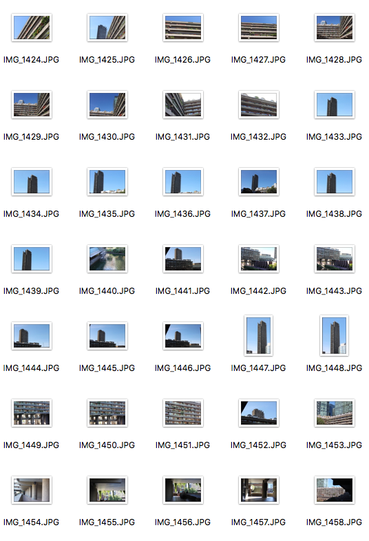
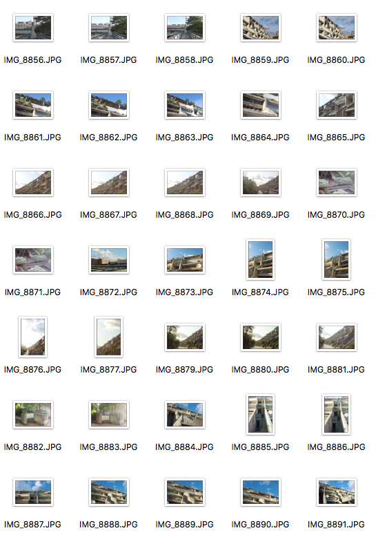
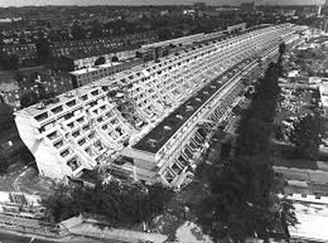
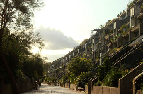
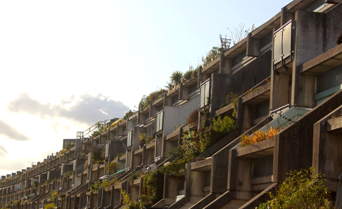
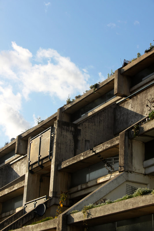
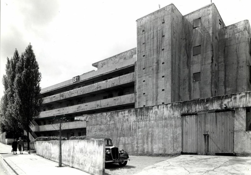
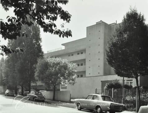
Shoot 4 - Alexandra Estate
|
|
History of Alexandra estate
|
The Alexandra Estate was the first post-war housing estate built in the late 1960s to be listed in 1993 and the youngest construction ever to be listed. At that time it was built, it was described as "one of the most distinguished groups of buildings produced in England since the second World War and of exceptional architectural interest". The estate was designated a Conservation Area in 1994. It is one of the largest Council-owned and built housing estates in Camden, London.
|
|
Edited Images
|
|
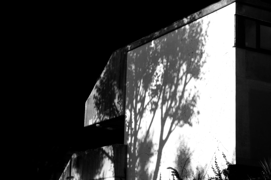
These images capture the pathway through Alexandra estate which divides brutalist architecture. I wanted to highlight the sunlight and define the buildings so i increased the contrast and saturation. There is almost surreal elements as the building seems to fade into the horizon. Architecture like this is so rare in our modern society so wanted to display it in the best way possible by capturing images from a range of angles.
|
|

Helene Binet
Helene Binet is a landscape and architect photographer with both a French and Swiss back-ground. She studied photography at the Instituto Europeo di Design in Rome, where she grew up, and soon developed an interest in architectural photography. Throughout a period of twenty-five years, Hélène Binet has photographed both contemporary and historical architecture. Binet is an advocate of analogue photography; she exclusively works with film. As one of the leading architect photographers in the world, Binet's images have led to her work being published in a wide range of books and shown in both national and international exhibitions.
“Hélène Binet has emerged as one of the leading architectural photographers in the world. Every time Hélène Binet takes a photograph, she exposes architecture’s achievements, strength, pathos and fragility.” -Daniel Libeskind
Binet's recognisable use of shadows and contrast in her photographs makes her images more like modern art than a simple photograph. They have a dynamic feel which is down to the way she captures light to create shapes and different shades of grey. The majority of her photography of architecture is in black and white which evokes the same emotions of loneliness yet also strength. (The strong lines and contrast present strength and the emptiness of the image indicates loneliness.)
Binet's work also incorporates similar elements to Nick miners which i hope to develop and experiment with in my own photography. Her use of isolating parts of the buildings and often working in black and white coincide with Miners work. I hope to use techniques from both photographers to try develop my work into a more abstract product.
|
|
|
"Artist and me"

|
|
Editing process :
|
|
|
On photoshop, I changed the colour to greyscale and then darkened the image. By increasing the contrast, this meant the light parts of the image still stood out, which was my intent. I selected the right half of the image using the magic wand tool and filled it in black. Making sure the edges were blended. I used the blur tool to make the lines less harsh.
|
|
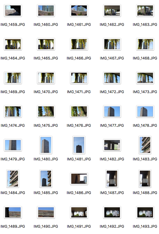
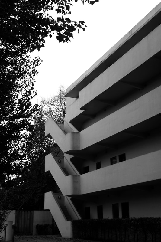
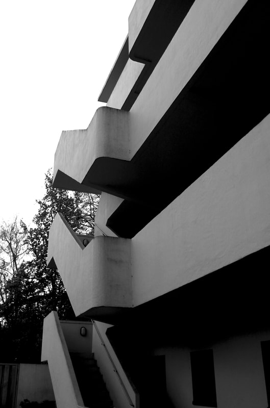
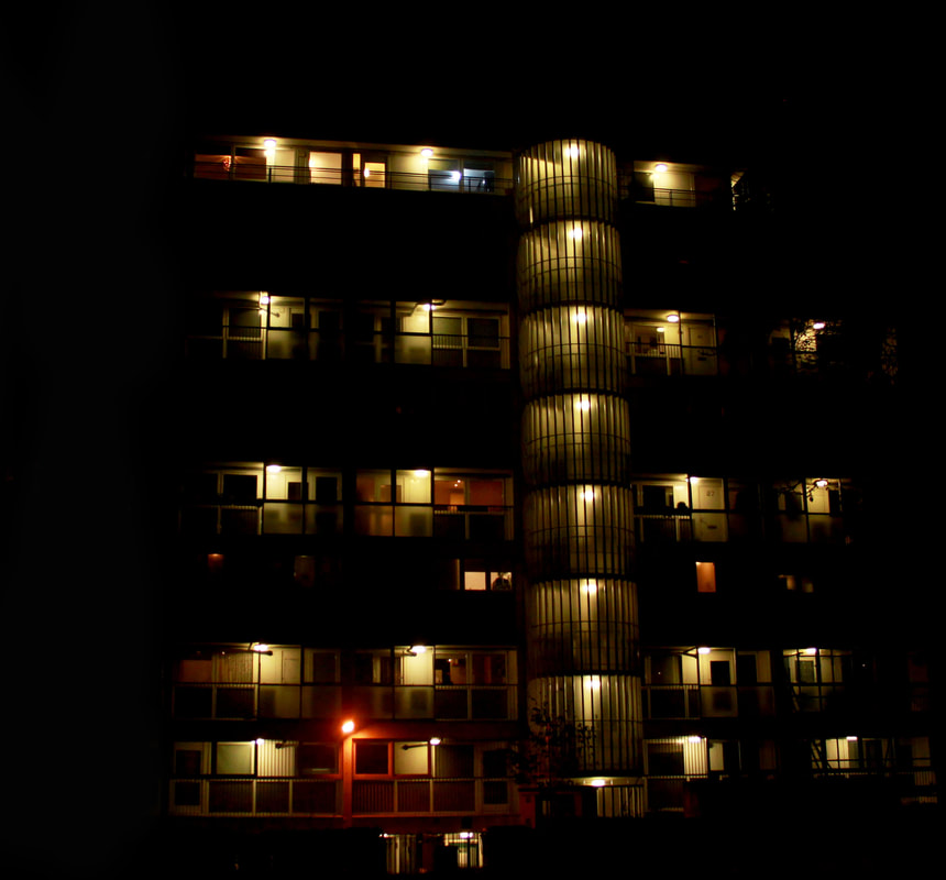
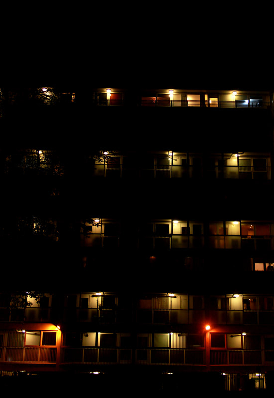
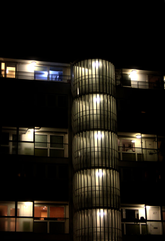
BShoot 5 - Isokon building
The Isokon Building (or Lawn Road Flats) was designed by Wells Coates for Jack and Molly Pritchard. Opening in 1934, it was seen as a new way of urban living. It was the first block ever to be built using primarily reinforced concrete. This Modernist apartment block was once home to Walter Gropius, Agatha Christie and Soviet spy Arnold Deutsch.
|
|
Black and white edits
I edited this image to contrast the blacks and white by adjusting the levels and the contrast. Taking inspiration from photographer Helene Binet, i attempted to make the shadows of the building almost black to create an unreal effect.

Inverse edits
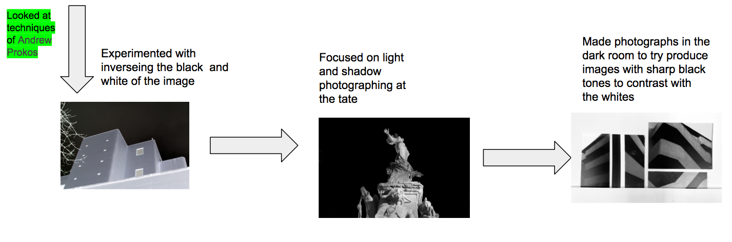
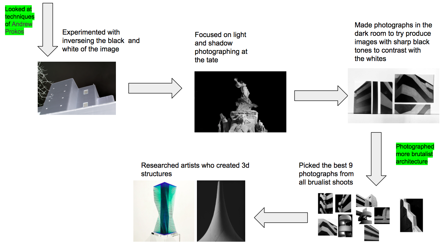
Andrew Prokos
|
Andrew Prokos is a New York City based architectural photographer. Andrew’s large-scale cityscapes capture the city in intricate detail. He uses the technique of long exposure to collect the light for long periods of time which results in photographs that are highly detailed. His series "Inverted" is what intrigued me as it presents common settings in an atypical way through the use of negative imagery. Prokos strips photographs of their colour and inverts the blacks and whites. This produces a surreal looking image that also looks futuristic. I am going to try edit my images of the Isokon building in a similar way to see if it is effective with Brutalist architecture.
|
|
"Artist and me"
|
|
|
The effect of inverting the colours gave a almost alien look to the image. Although i like the flipped tones of the shadows and whites, i think the trees weren't as effective. I am going to experiment more with the pictures of just the architecture so the focus is just on the black and white tones.
|
|
I think the inverting editing worked the most effectively on this image of the Isokon building. This is due to the fact that the shot already highlights the straight lines of the building so inverting the colours draws the views attention to the form and structure of the brutalist architecture.
|
|
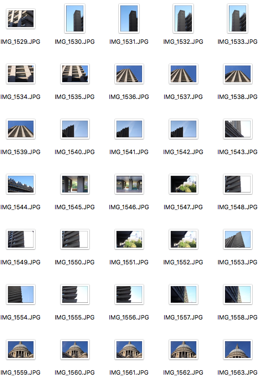
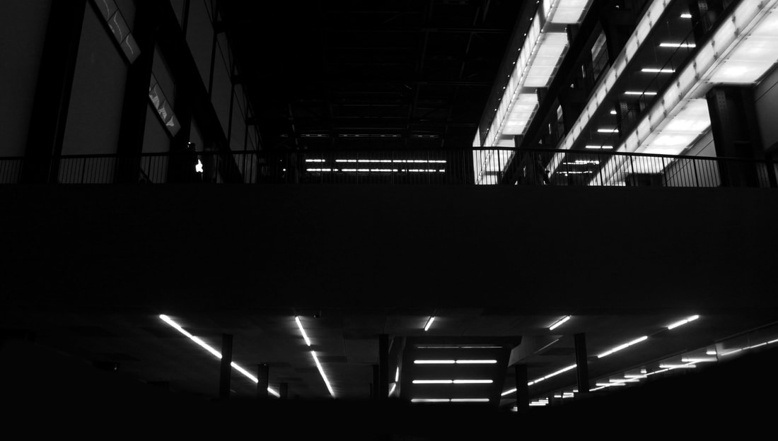
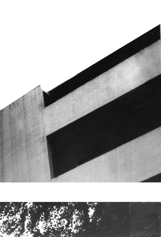
Shoot 6 - Tate Modern
|
|
Black and white edits
Shoot 7 -
|
|
|
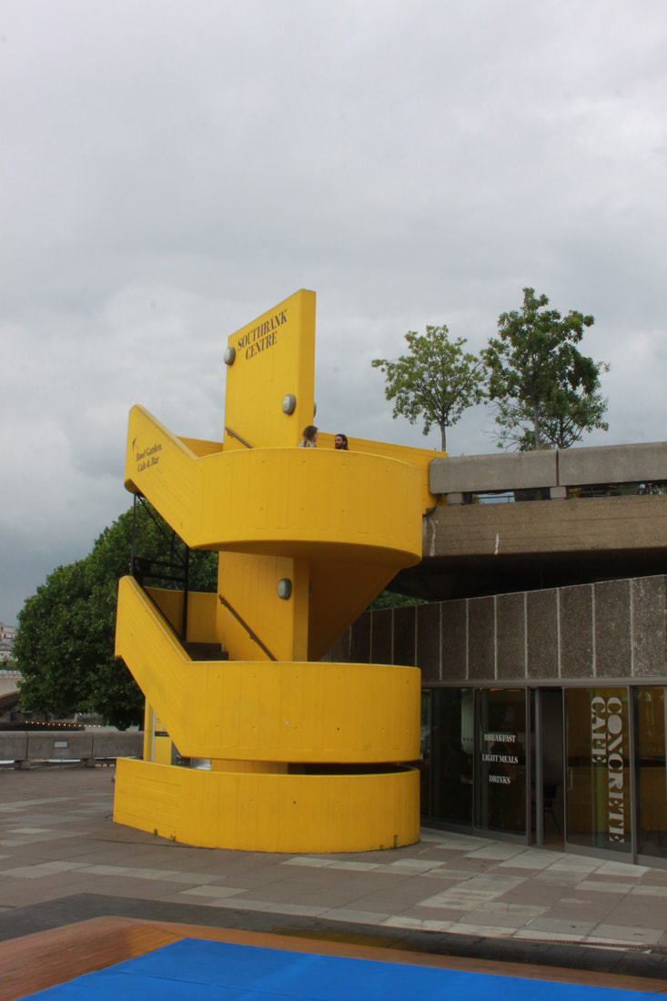
Shoot 8 - South bank
|
|
|
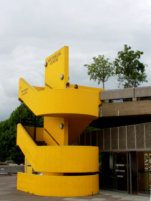
|
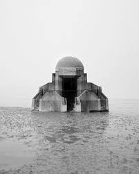
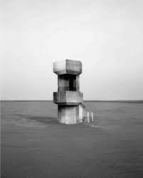
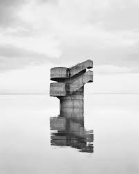
Noemie Goudal
Noemie Goudal is french photographer who challenges to boundaries of reality and present through surreal landscapes created on photoshop. She edits hard concrete architecture into a watery wasteland creating a distorted view on reality. The majority of the architecture chosen has a brutalist atheistic.
|
|
"Artist and me"
|
|
|
These are the two images I chose to comping into one. Editing the people out was done by using the cloning took on photoshop. Also putting the two images in black and white helped blend them into one.
|
|
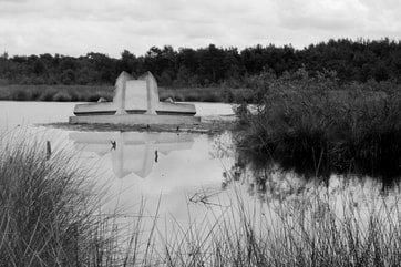
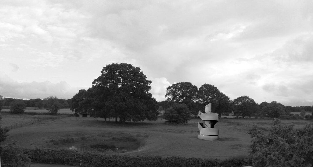
To create my own depiction of Noemie Goudal's brutalist photographs, I merged images I took of a natural landscape in Yorkshire and brutalist architecture I shot at south bank. By using photoshop I able to cut out parts of the architecture and paste it onto the natural landscape. then to make it look more realistic, I blending the clones the outline so the harsh brutalist structure would fit in.
|
|
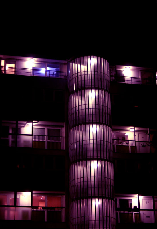
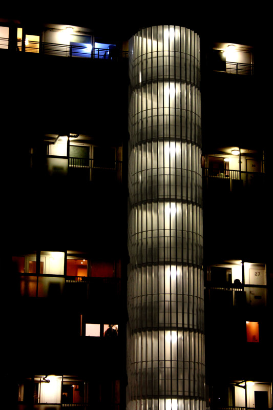
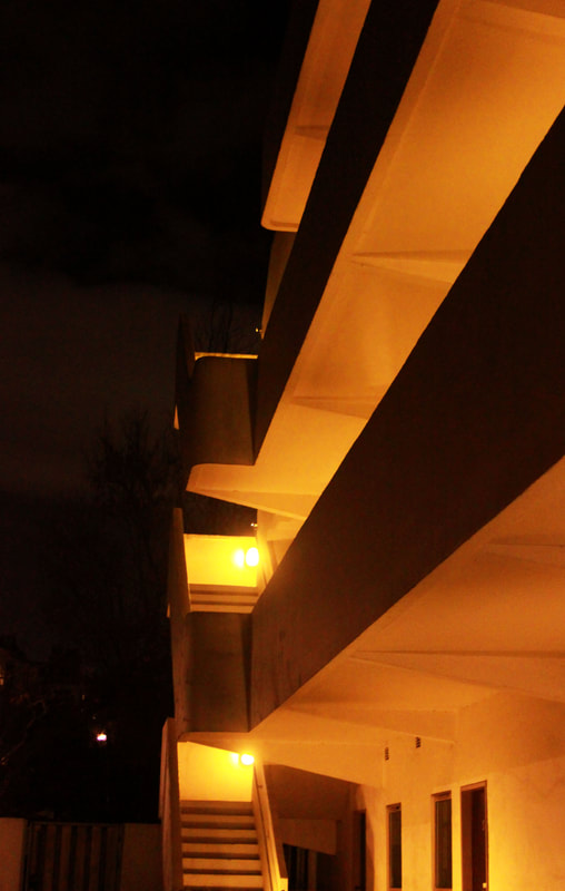
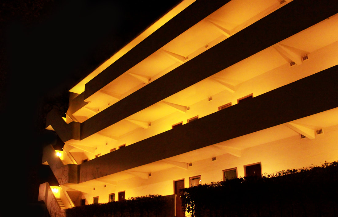
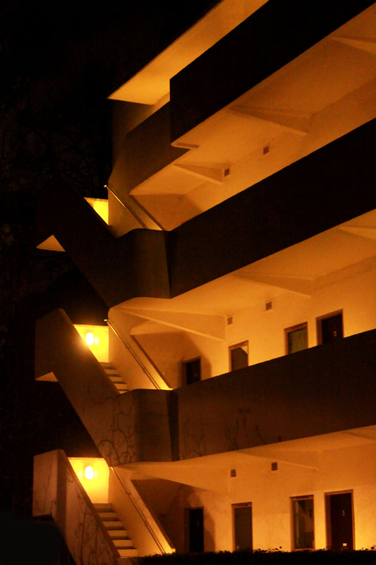
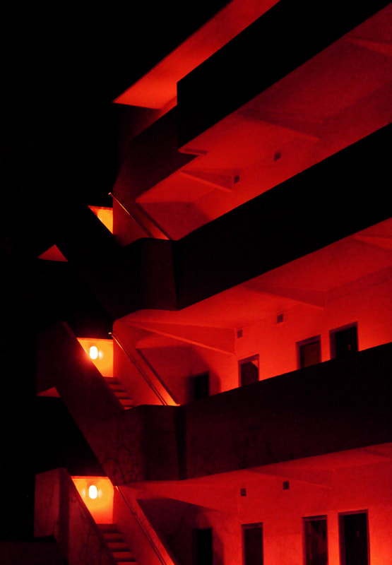
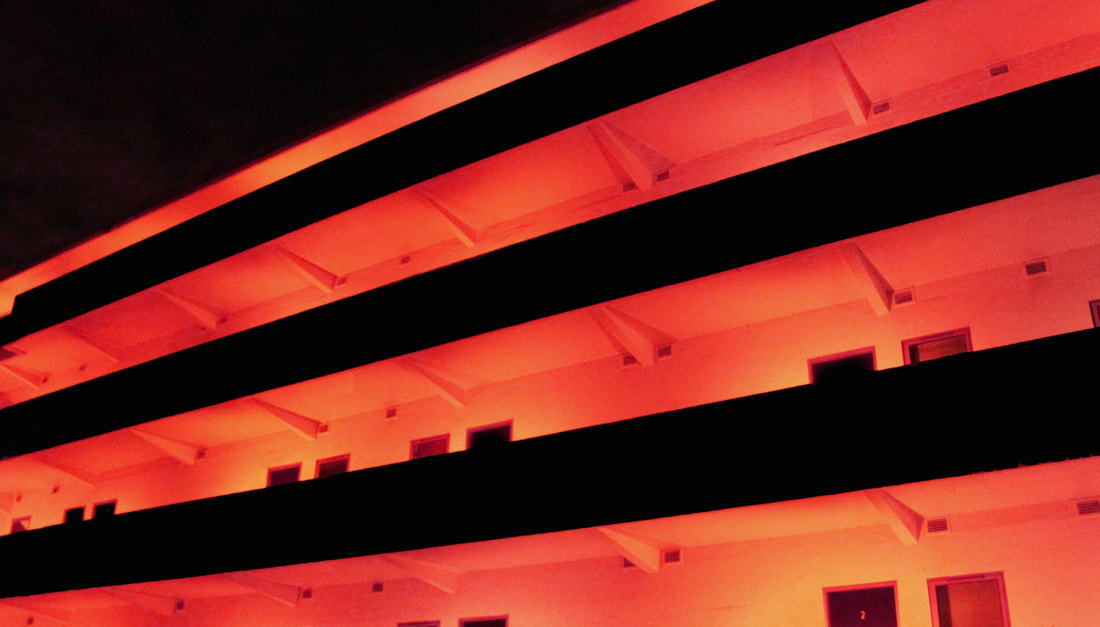
Shoot 9- Isokon Building at night
I revisited the Isokon Building at night to photograph it in a contrasting light. My aim was to re-shoot the same architecture while trying to create a completely different effect and then compare the outcomes of the two shoots. The contrast between the yellow, glowing lights of the building and the surrounding darkness creates an eery atmosphere. However, at the same time, the pale orange glow gives a warmer feel to the night images. While some of the images are interesting and could be worth investigating further, I think I prefer to focus on monochromatic images.
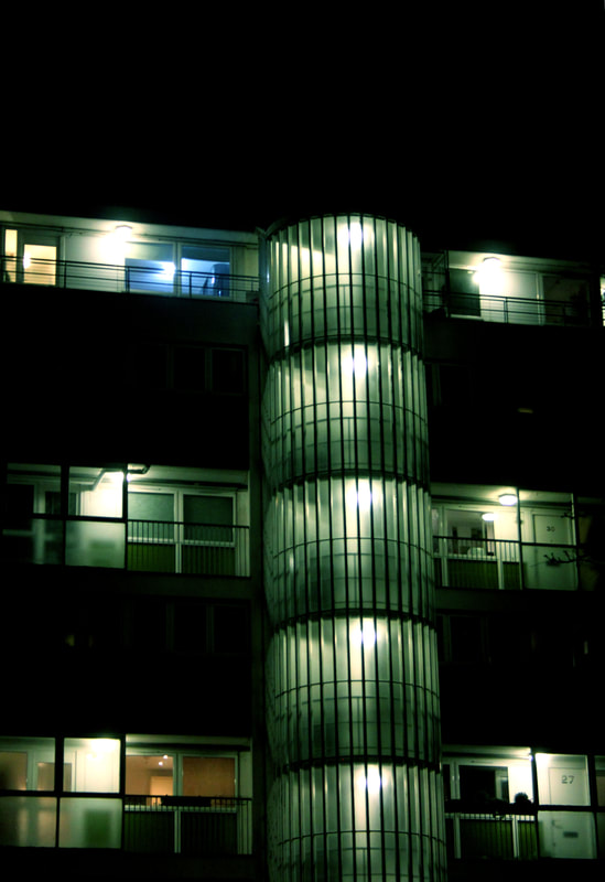
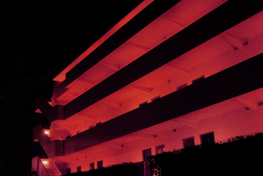
Experimenting with colour
Using photoshop, I adjusted the colours of the white light to red to see if it was more effective than the simple black and white effect. The red added more emotion; the colour and tones however could be distracting from the sharp lines and shapes of the building. Moving forward with my work, I think I will be editing my images to highlight the unique shapes and forms of the Brutalist buildings rather than changing the colours. This is because the key elements of Brutalist structures are the lines within them so I would want to focus of this aspect. I think I could develop concept by simplifying the image down into pure shapes, increasing their abstract nature, rather than shooting the whole of the buildings. By editing and framing fragments and sections of the buildings, I will be able to create the images I want.
Nicholas Alan Cope
|
Nicholas Alan Cope's photographs evoke a unique vision of Los Angeles. In his images, he peels away the details of the buildings to leave only simple, white, geometric shapes. His images isolate elements of the architecture to reduce the buildings to fragments. Their black and white colourings further simplify the images; taking away any colour or imperfections allows the viewer not to be distracted by any imperfections. Cope uses the strong sunlight of LA to enhance sharp lines of shadows created by the buildings. These dark shapes contrast with the clean white of the buildings making the images look more like abstract paintings than photographs. Some interpret Cope's images of LA as a reflection of the 'tinseltown' culture of the city; like LA film stars, these buildings are manicured and enhanced to perfection.
|
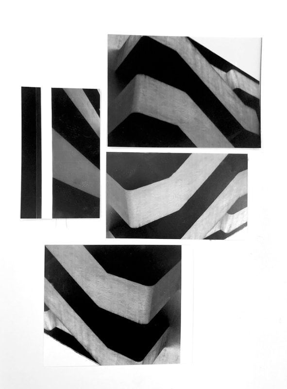
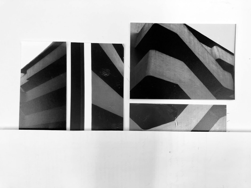
Photographs developed in the dark room
To experiment with the shades of black and white, I developed images in the dark room. In this way, I was able to explore whether this technique would be more effective than using photoshop. Overall, throughout the process, there were more complications using traditional methods in the dark room than editing in photoshop. The experience was interesting however I found I had less control on the overall outcome of the finished image in the dark room than when I used photoshop.
|
|
|
|

Shoot 10 - The Brunswick Centre
|
|
Black and white edits
|
For these black and white edits I cropped and flipped some of the photographs in an attempt to isolate parts of the building. Putting all the images in greyscale further takes the image out of its location and focuses the viewer's attention onto the shapes and curves of the architecture. The images were edited in this way to present them as more abstract shapes than photographs. I will further experiment with this concept in my final piece.
|
Final piece for mock
|
|
|
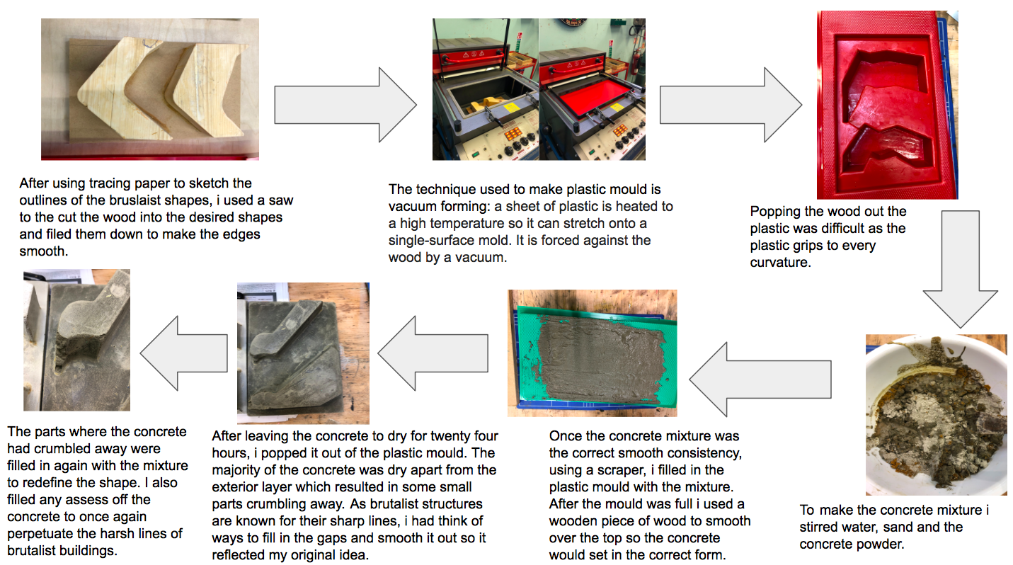
Plan for final piece
-Choose the best 9 abstract images from all Brutalist shoots.
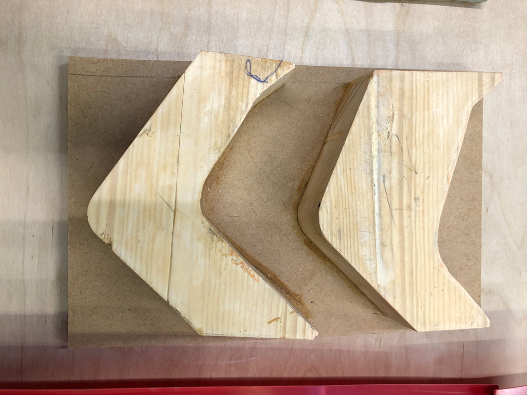
-Sketch the shapes onto tracing paper.
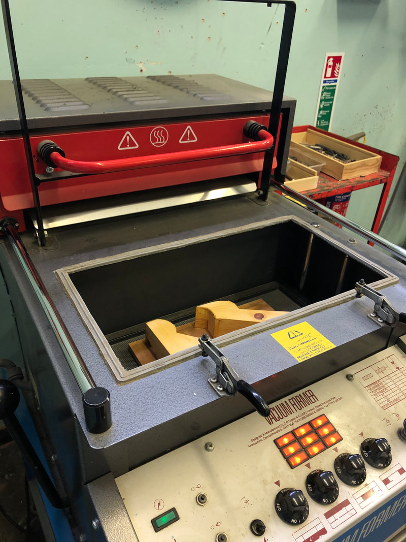
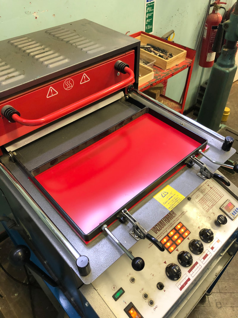
-Create mock-ups in wood and then vacuum-form the shapes into a plastic mould.
-These moulds will have concrete poured into them to create a 3d sculpture
-These sculptures will then be rephotographed in the studio so the images can go alongside the sculptures.
-Choose the best 9 abstract images from all Brutalist shoots.
-Sketch the shapes onto tracing paper.
-Create mock-ups in wood and then vacuum-form the shapes into a plastic mould.
-These moulds will have concrete poured into them to create a 3d sculpture
-These sculptures will then be rephotographed in the studio so the images can go alongside the sculptures.
Artist research on 3d models
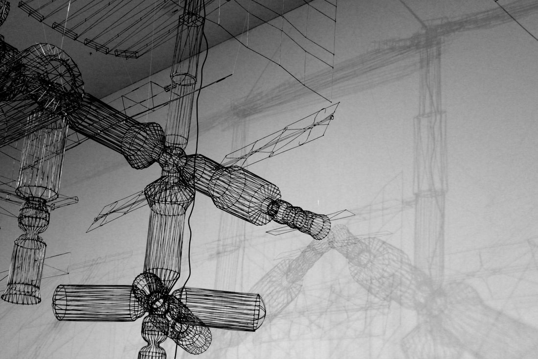
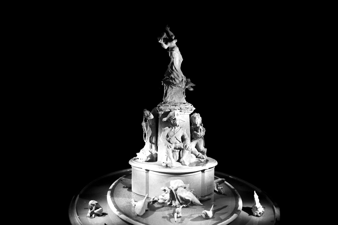
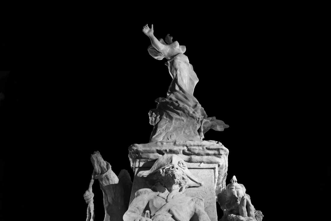
Hiroshi Sugamoto - mathematical model
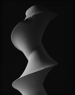
Dini's Surface: a surface of constant negative curvature obtained by twisting a pseudosphere (2004)
|
Hiroshi Sugamoto's series 'Conceptual Forms' consists of black and white photographs of plaster models. The models demonstrate a mathematical formulae brought to Japan during the early 20th-century. Currently, these models are showcased at the University of Tokyo. During 2004, Sugamoto started photographing the plaster models against a black background to highlight the curvatures within the forms. The shapes of and shadows on the sculptures create abstract forms but Sugamoto, in simple terms, offers viewers a visual image for mathematical equations.
Sugamoto explains his fascination with facts and the abstractions in reality: 'Even when I was a school kid, my favourite bedtime stories were not fairy tales, but factual accounts. Nights when I could not go to sleep, I would beg my grandmother for the real-life stuff.' |
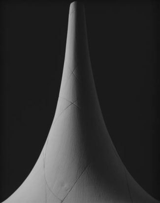
Surface of Revolution with Constant Negative Curvature (Conceptual Form 0010) (2004)
|
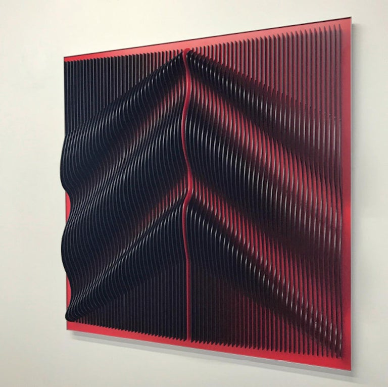
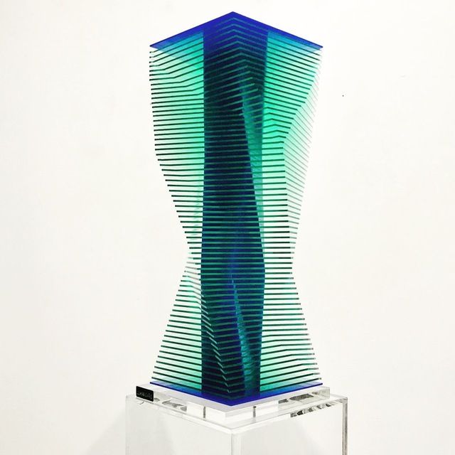
J. Margulis
|
J. Margulis produces acrylic 3D sculptures made from different types of colorful plastic sheets. He interconnects plastic sheets onto 2d surfaces or sometimes creates free standing structures. He began photographing his pieces as a way of documenting them. Margulis considers the viewer by allowing the geometric shapes to change from different perspectives. His work challenges the viewer's perception of reality through its abstract forms and optical illusions.
Another important element in Margulis's work is the way he manipulates light through the translucency of colour. He puts emphasis on using strong, bright and contrasting colours to complement the flowing, curved shapes. |
|
|
Oliver Boberg
Oliver Boberg is a German photographer known for his depictions of Brutalist architecture. Despite his photographs looking like actual buildings, (and occasionally even buildings under construction) Boberg’s images are photographs of life-like, small-scale models made in his studio. Using a range of techniques and materials (plywood, glue and cardboard) he meticulously builds the models to scale and then shoots each maquette from various angles. By using lighting in his studio, Boberg attempts to mirror natural lighting. Boberg’s works often hint at dark and dingy themes to create the feeling in the viewer that they have seen the places located in his photographs before. However, the places in his work are actually surreal creations of his imaginations.
|
|
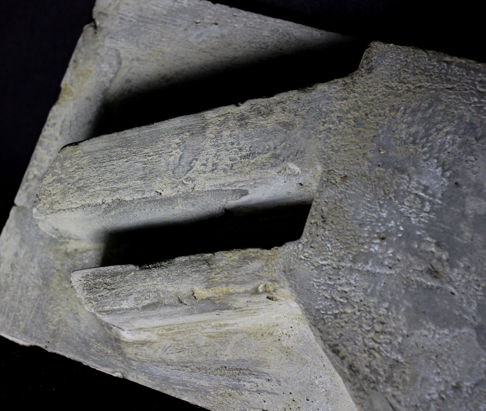
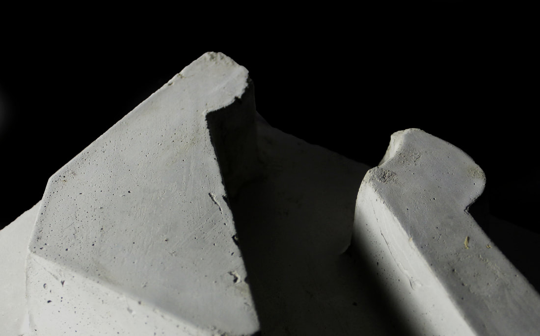
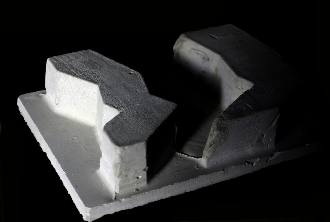
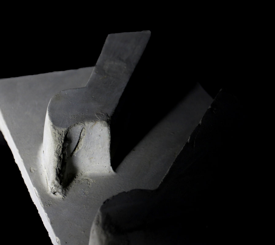
Process of creating 3d concrete model
|
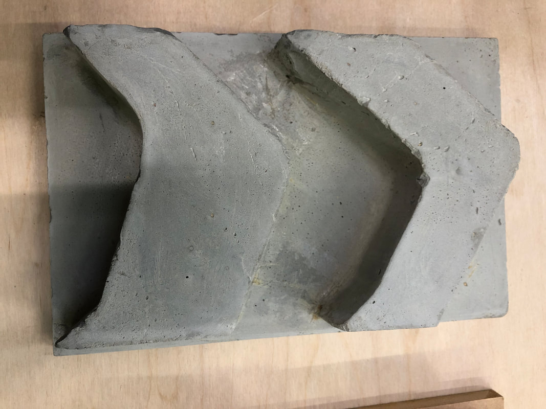
|
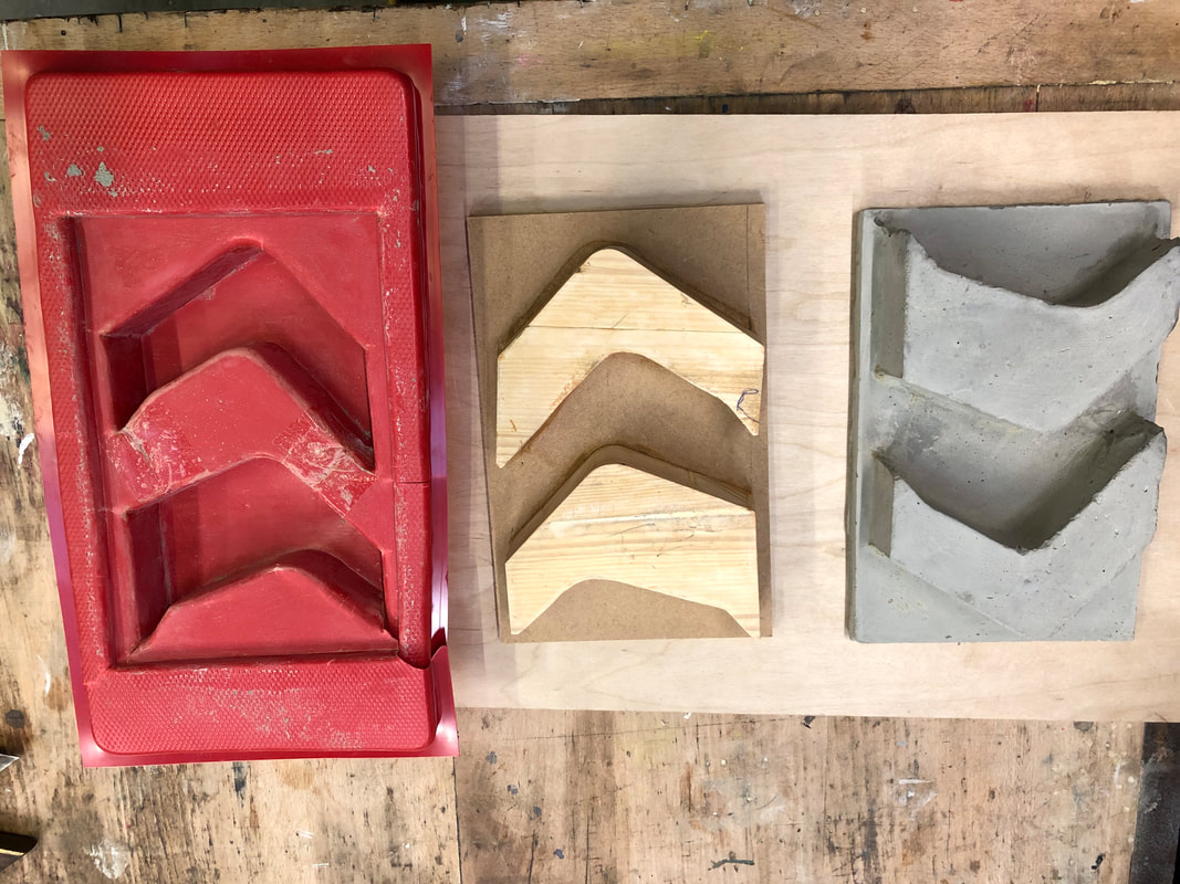
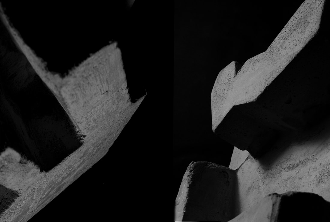
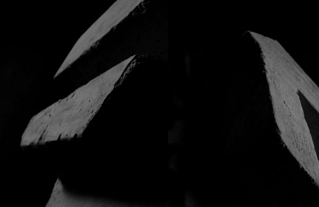
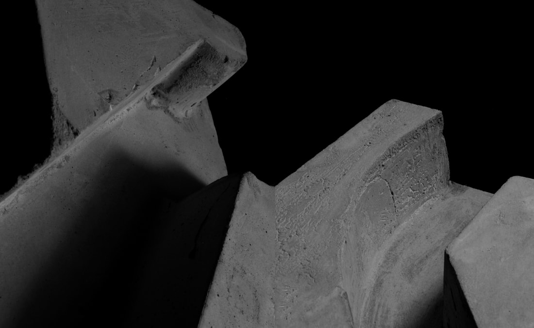
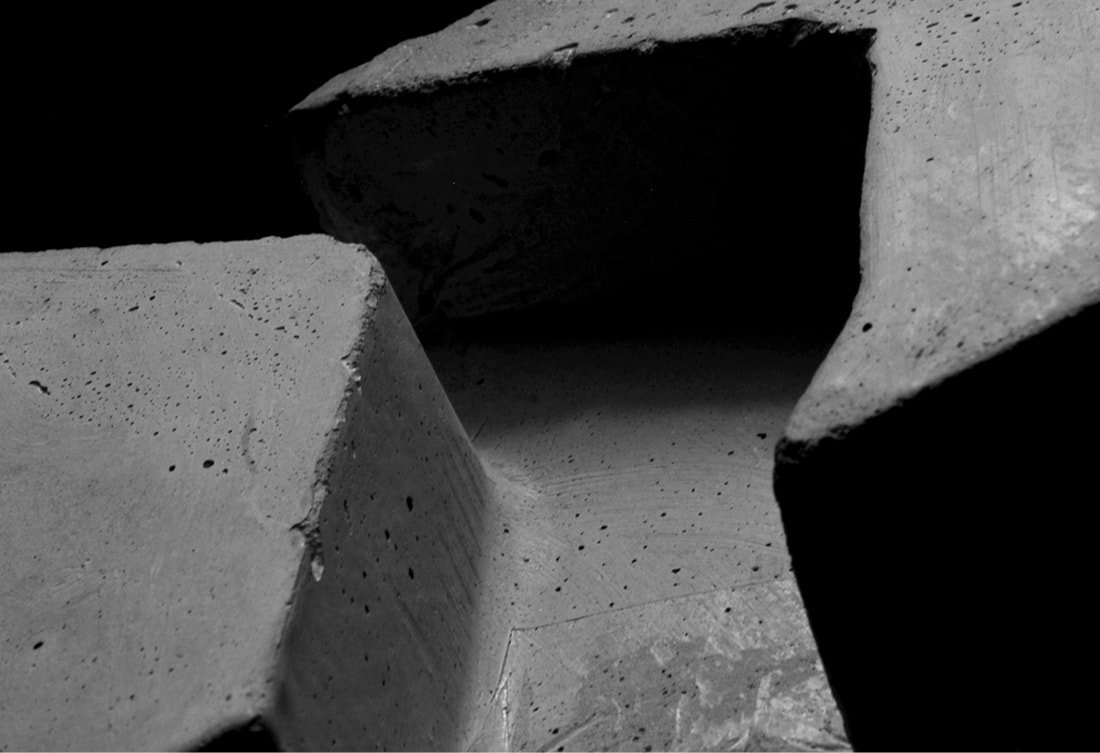
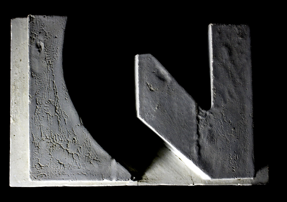
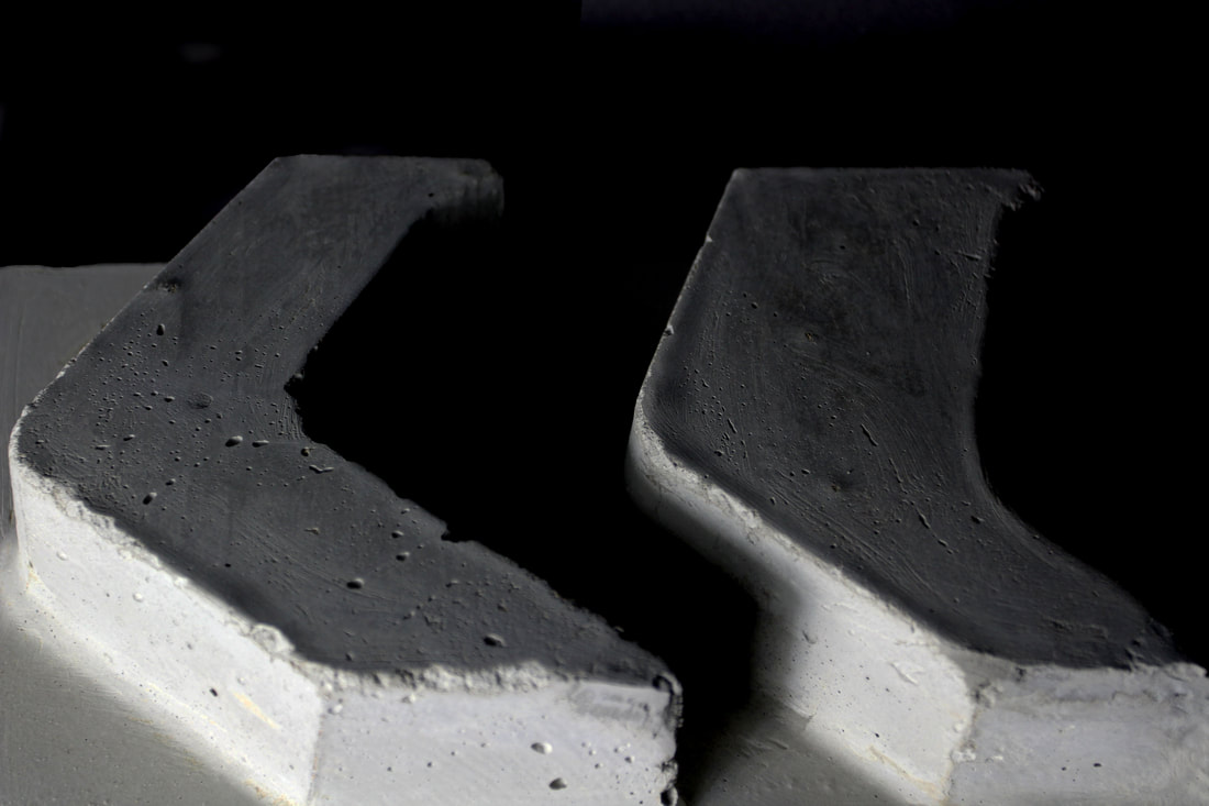
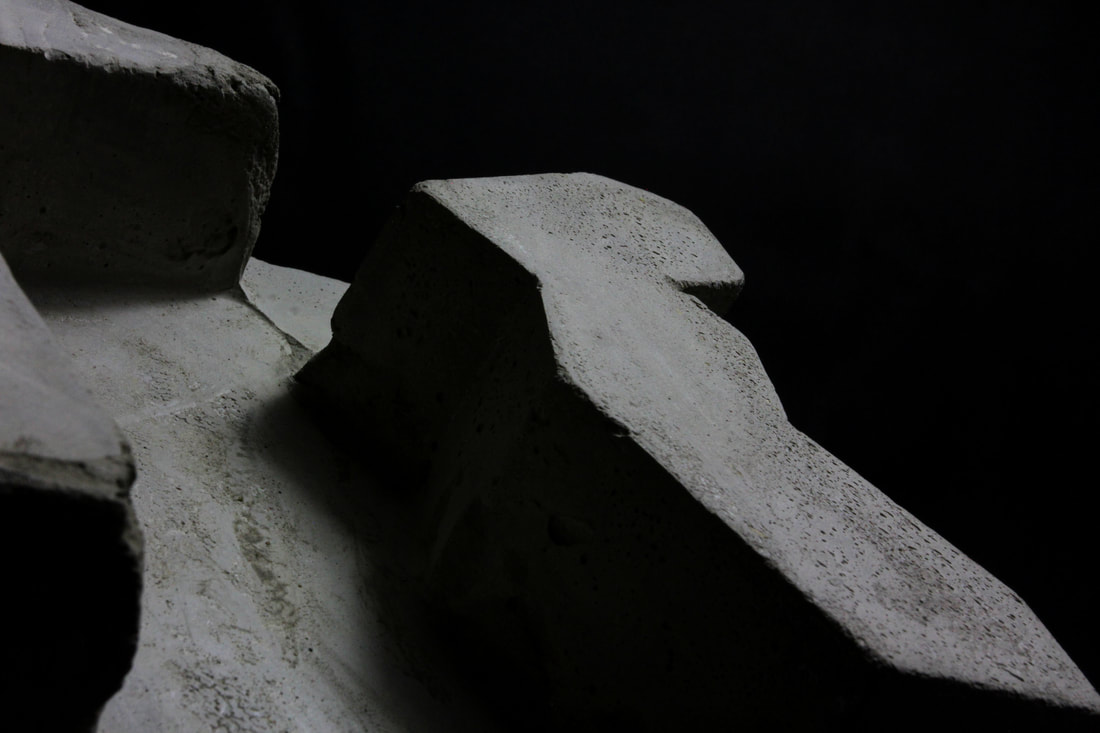
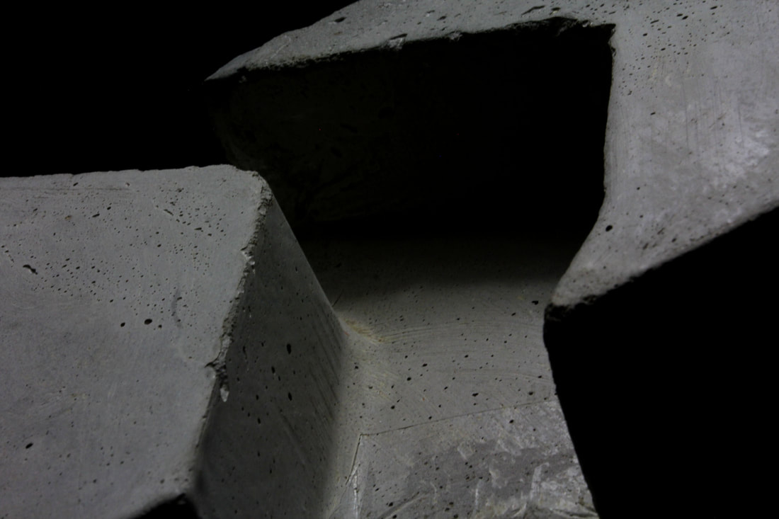
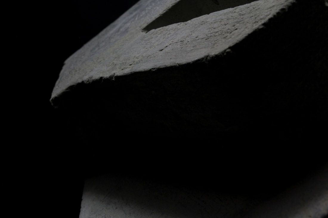
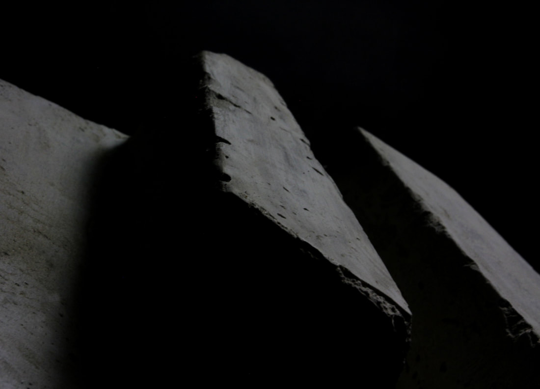
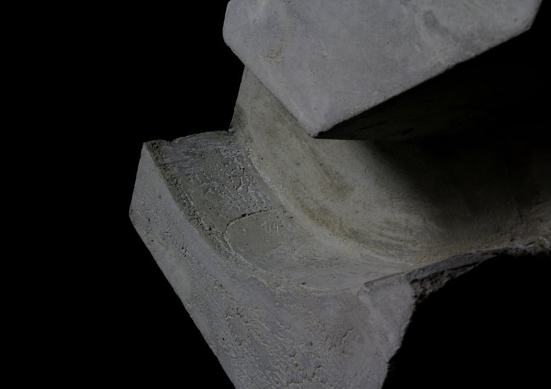
First shoot
I photographed the six concrete moulds with studio lighting to emphases shadows of the shapes. This was to produce a more abstract final product. photoshop also allowed me to further highlight parts of the mould and darken the surrounding areas. Although my original plan was to create 9 moulds, some of the shapes with curvatures were difficult to make 3D. So this resulted in choosing the top six so I could focus my efforts into making them sharp as I could.
Second shoot
|
|
|
|
|
|
Final piece